



Free Monogram Logo Bundle: 26 Hexagon Letter Icons
 4 min read

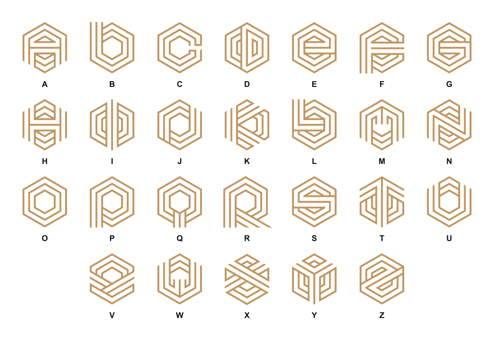
This free monogram logo bundle gives you 26 hexagon letter icons, one for every letter from A to Z. Each letter is drawn with parallel lines that follow a hexagon outline, so the whole set shares one clean, geometric look.
Below you will find what is in the ZIP, which file formats you get, and how to turn one of these icons into a real monogram logo for your brand or a client’s. There is also a short tips section and answers to common questions.

Licence: free for personal and commercial use. You can use the icons freely as a template or starting point for your branding projects.
What is in the monogram logo bundle
The ZIP holds 26 monogram letter icons in a matching hexagon style, ready to open in a vector editor or drop straight into a layout:
- Monograms.ai and Monograms.eps: the full set of 26 letters as editable vectors.
- Black.ai and Black.eps: a black version of the set. In Black.ai each letter sits on its own artboard.
- Transparent folder: 26 PNG files in gold on a transparent background, 4167 x 4167 px each.
- Two preview images and a short Info.txt guide.
The AI files are PDF-compatible, so they open in Illustrator and in most other vector apps. The EPS files are there for older software and print workflows. There is no SVG in the ZIP, but you can export one from the AI file in a few clicks. One small thing to know: the PNG files are numbered in keyboard order (Q, W, E, R, T, Y and so on), not A to Z.
When a monogram logo suits a brand
A monogram logo uses one or more initials as the main mark. It works best when the brand name is long or hard to fit in small spaces, or when the business is built around a person or a family name. Think law firms, architects, consultants, interior designers, jewellers, fashion labels and boutique hotels.
The hexagon adds a feeling of structure and precision, which suits construction, tech, engineering and property brands. In gold on a dark background, the same hexagon logo leans towards the luxury logo end of the scale. In plain black it reads as a minimalist logo.
A monogram is a weaker choice for a new brand that nobody knows yet. Initials alone do not tell people what you do, so pair the icon with the full name until the brand is familiar.
How to turn a monogram icon into a real logo
The icons are a starting point. A few changes make a monogram feel like it belongs to one brand and not to a template.
Adjust the spacing
Each letter is made of parallel lines, and the gaps between them matter as much as the lines. Keep the gaps even, and check the icon at 32 px. If the lines merge into a block at that size, open up the spacing or make a simpler small-size version.
Change the line weight
Thicker lines feel bolder and more modern. Thinner lines feel lighter and more refined. Match the weight of the icon to the weight of the font you pair it with, so the two look like one design. Our guide to lines in graphic design covers how line weight changes the mood.
Pair it with a wordmark
Place the brand name next to or under the icon. The guide in the ZIP suggests Montserrat, a geometric sans serif that matches the straight lines of the hexagon. A small, spaced-out slogan under the name finishes the lockup. Our font pairing tips help if you want a second typeface.
Tips for using a hexagon monogram logo
- Combine two letters with care. Overlapping two hexagon icons gets busy fast. Try placing them side by side first.
- Pick one brand colour. Swap the gold for your brand colour, and keep a one-colour version for stamps and embroidery.
- Build a full logo set. Make a stacked version, a horizontal version and an icon-only version. Our post on logo variations explains which ones you need.
- Make it your own. Anyone can download these icons, so change the spacing, weight or shape before you use one as a main brand mark.
- Write the rules down. Note the clear space, colours and minimum size in a brand guideline document.
For the basics behind every good mark, read our key principles of logo design.
Frequently asked questions
What is a monogram logo?
A monogram logo is a mark built from one or more letters, usually the initials of a brand or a person. Fashion houses, law firms and hotels use them a lot.
Can I use these monogram icons for commercial work?
Yes. The bundle is free for personal and commercial use, as a template or starting point for your branding projects.
Which file formats are included?
AI and EPS vector files, plus 26 transparent PNGs. If you need SVG or PDF, export them from the AI file.
How do I make a monogram logo with two letters?
Copy both letters onto one artboard, scale them to the same size and line them up side by side. Keep the gap between them equal to the gap between the lines inside each icon, so the pair reads as one mark.
Need a logo for a client?
Inkyy is a white label design and development team for agencies. Our in-house brand designers create original logos and full identities that you deliver under your own brand. See our design services or book a 15-minute call.


