



20 Real Estate Logo Ideas: Roofs, Keys and Monograms
 9 min read
A good real estate logo has a hard job. It must look trustworthy on a yard sign, a listing portal and a business card, and still stand apart from every other rooftop icon in town. Realtors, agencies, developers and property managers all reach for the same few symbols, so the details decide which logo people remember.
Below are 20 real estate and realtor logo designs, grouped by idea: houses and roofs, keys, monograms, buildings and landmarks, and luxury, coastal and land brands. For each one we note what the designer did well and which kind of property business the style suits. Design tips and a short FAQ follow the list.
What a real estate logo says about a brand
The symbol you choose sets expectations before anyone reads the name. Here is what the common choices usually signal:
- House or roof: homes and families. The safest choice for residential agents, but also the most crowded.
- Key: handover, security and a fresh start. Popular with individual agents and lettings firms.
- Monogram: a personal or premium brand. Works for agents who sell many property types and for luxury teams.
- Building, skyline or landmark: commercial property, apartments and city specialists. A local landmark says local expert.
- Nature and land: trees, fields and animals for rural, farm, ranch and acreage brokers.
The common traps are a generic chevron roof over a plain sans serif, so many windows and chimneys that the icon blurs on a sign, and colours copied from the big franchises. Most designs below avoid them with one clear idea, such as a letter that doubles as a roof. If you are building a whole online presence, our roundup of real estate website designs shows how logos like these carry through to a site.
20 real estate logo ideas
House and roof logos
The house is the most common symbol in the niche, so these designs win on small, clever details.
1. House Logo Marks by Big Sea
Two unused house marks drawn with the same thick, even stroke. The first hides a door and two windows inside the outline; the second stacks two house shapes so they read as a neighbourhood. Both hold up as solid one-colour marks, which makes them a good fit for a brokerage that needs a symbol for yard signs, lockboxes and app icons.
2. Q roof monogram by onripus

The tail of the Q becomes a roof, and a tiny four-pane window sits under it. It is one letter and one idea, which is exactly why it works. A strong direction for any agency or property app whose name starts with a single letter.
3. Cozy Closing by Musique!
A house outline sits inside an armchair, drawn in one grey line weight. The pun tells you this is home staging, not sales, before you read the name. Simple line art like this suits staging, interior and property styling businesses that want to feel friendly rather than corporate.
4. Cherry Hill Estates by Bishusal
Three gabled houses sit on striped fields under a cherry blossom branch, all held in a navy circle. The pink flowers illustrate the name, and the spaced serif capitals feel settled and upmarket. It suits a residential development or a neighbourhood-focused agency, though the blossom detail will need a simplified version for small sizes.
5. Jodi Hilliard Realtor by Naseeb U
A personal realtor logo built from a handwritten signature, a small house in a circle and REALTOR in bold capitals. The signature feels like a person, not a franchise, and navy and white keep it professional. A good template for an independent agent whose name is the brand.
Key logos
A key says handover and security. These designs tie it to a name or initials.
6. Bradon Schwarz by Mhosneezaman
The initials B and S form the bow of a long, old-fashioned key, with the name set in a clean sans serif below. Dark red on white and a maroon reverse version give it a warm, established feel. A neat solution for an individual agent who wants their initials and a property symbol in one mark.
7. Dani Robinett Real Estate by Arthean
A slim vintage key stands between the letters D and R inside an arched frame, all in a fine line. The light, spaced capitals and soft palette give it a boutique feel. It suits an agent who sells homes to design-conscious buyers, but the fine lines need a minimum size on print.
8. John Gibson Fine Homes by katie_kat
An ornate key with a bird inside its bow sits next to a large signature-style name and small FINE HOMES capitals. The mix of illustration and handwriting feels personal and high end. It fits a luxury agent or a fine homes division, though the key would need simplifying for a favicon.
Monogram and initial logos
Monograms do not tie a brand to one property type, which suits growing agents and firms.
9. Cullen Millsap Real Estate by Courtney Smith
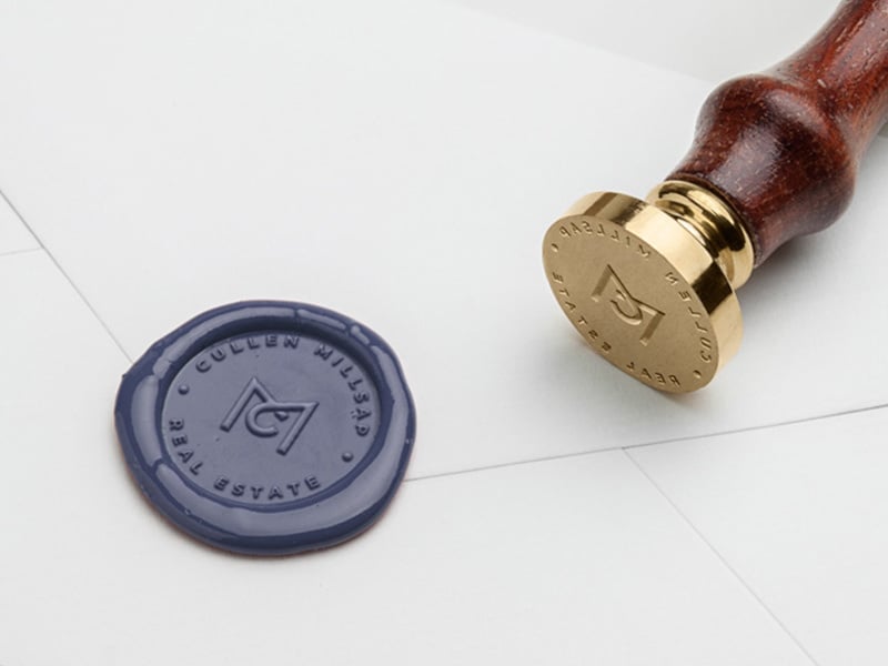
An angular M and C monogram shown as a navy wax seal, with the firm name running around the edge. It shows how a monogram can work on stationery and closing gifts, not just on screen. A fitting idea for a boutique agency that wants to feel personal and a little traditional.
10. Robert Kelly by Aleksandar Coric
At first glance it is a classic serif RK. Look again and the arm of the K forms a roof with a tiny square window under it. The hidden house is subtle enough for a luxury agent, and the black and white layout with a thin divider looks good on business cards and signboards.
11. Kings Bay Partners by Arthean
The K and B share one gold line that traces a roof, with a small square window at the base. Navy and gold are a familiar pairing in property, but the clean geometry keeps it modern. A sound choice for a partnership or investment firm that wants a symbol without a literal house.
12. Supreme Realtor & Partners by dznWILD

A tall gold serif monogram of S, K and P, with the full name stacked beside it. The deep teal background is a welcome change from the usual navy. This style suits an established team or a firm selling high-value homes.
Building, skyline and landmark logos
A building or a local landmark shows where and what an agent sells.
13. Buy & Sell Portland by CSJStudios
A cable-stayed bridge, a local landmark, sits above a yellow and green wordmark. Using a well-known structure instantly says local expert, which is the whole pitch of a city-focused agency. The bright two-colour type is bold but would need care next to other brand colours.
14. Meadows Mile Professional Building by undrthespellofmars
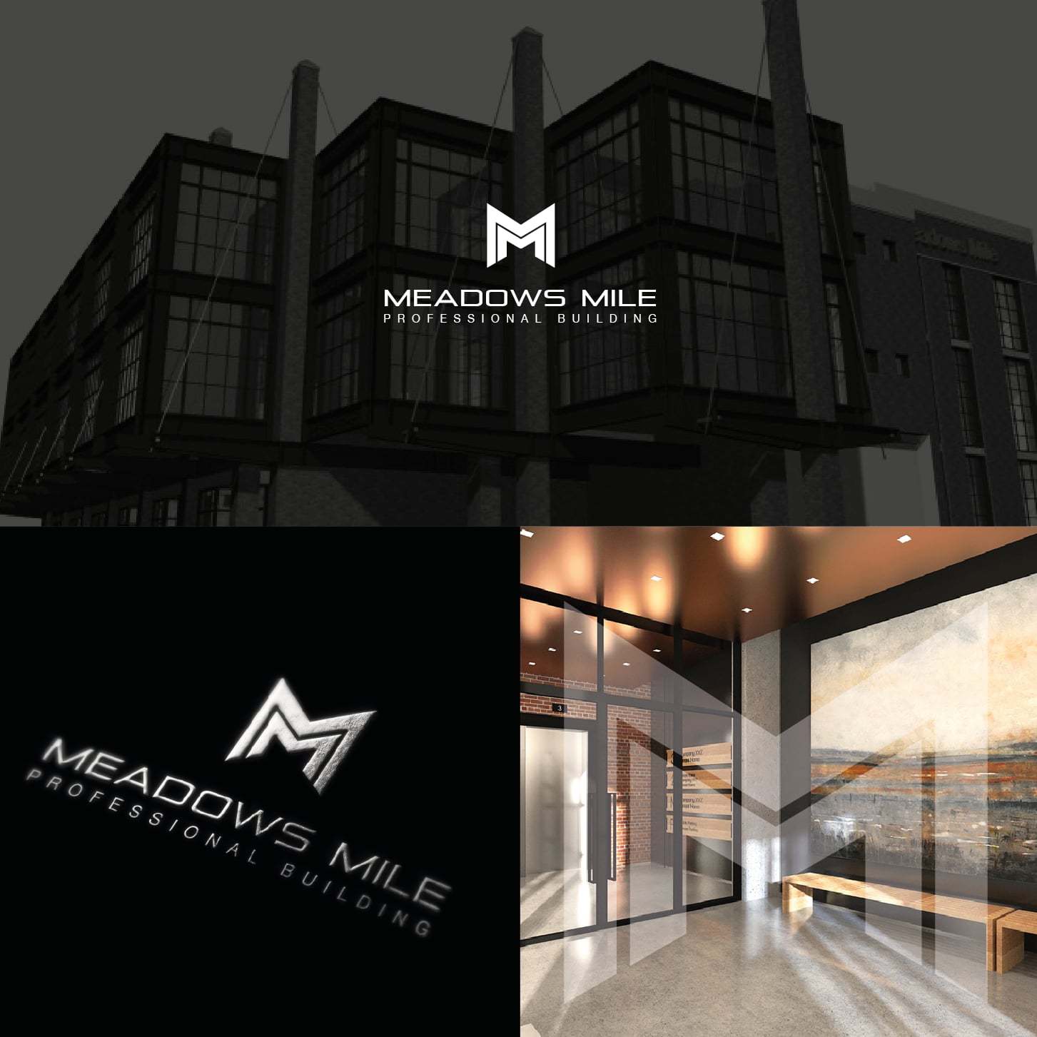
A sharp M monogram for a commercial building with medical tenants, shown on the facade, embossed on black and on a lobby wall. One letter scales from signage to door plates without losing detail. A good reference for branding an office block or mixed-use scheme.
15. Mila Apartments by KVA
The M is drawn as a small apartment block with windows, in a single dark red. Paired with a serif wordmark, it feels like a classic Italian hotel sign. It suits short-let operators, serviced apartments and property managers who want warmth rather than tech.
Luxury, coastal and land logos
High-end, coastal and rural property each have their own visual language.
16. Von Kauffmann Andersen Ejendomme by Aleksandar Coric
A detailed line drawing of a classical mansion sits above a wide serif name, in cream on warm brown. It feels old-world on purpose, which suits a Danish firm selling premium properties. The agency will still need a simpler mark for small uses.
17. Imperial Development by dm82design
Four vertical bars join a house outline, so the mark reads as both an I and a building. The gold finish and wide spaced capitals point at high-end custom homes. A good model for a developer or builder that wants to look premium without a crest.
18. Outer Banks Living by Naseeb U
A palm tree, a tiny house window and three waves stack above a relaxed script. Teal, coral and cream say beach before you read a word. It is made for coastal and holiday-home agents, but palm trees are common in this niche, so the house detail is what keeps it specific.
19. Hunt & Farm Realty by 3 Plains
A deer, two wild turkeys and corn stalks stand on a hill of ploughed fields, all in olive greens. It tells buyers exactly what kind of land this broker sells: hunting and farm property. The heavy wordmark is easy to read on trucks and signs, which matters for rural agents.
20. Land & Home Real Estate Group by Sign.Yra
A broad oak tree grows out of an LH monogram, framed by a thin gold ring. The tree stands for land and roots, and the monogram keeps the firm name in the mark. It suits an agency that sells both acreage and family homes.
Tips for designing a real estate logo
- Start with one idea. A roof, a key or a letter is enough. Combine two only when they merge into one shape, like the RK and KB monograms above.
- Design for the yard sign first. Real estate logos live outdoors, on signs read from a moving car. Test the mark at a distance and in one colour before you add detail. The key principles of logo design apply here more than anywhere.
- Pick colours with care. Navy and blue suggest trust, green suggests land and growth, and gold suggests luxury. Read our guides to blue in branding and green in branding before you settle, and check what the agencies near you already use.
- Plan the variations. You will need a full lockup for signs, an icon for social avatars and a one-colour version for embossing and engraving. Here is how to plan logo variations.
- Leave room for the brokerage. Many agents must show their brokerage name or licence details next to their own logo. Design a layout that still looks tidy when that line is added.
- Match the market. A luxury team needs restraint and good type; see our luxury logo ideas for more. A developer or builder can borrow from construction logo ideas, and a monogram can start from a free monogram icon set.
Frequently asked questions
What makes a good real estate logo?
A simple shape that reads at a distance, a name that is easy to say, and one idea that sets it apart from the usual roof icon. It should work in one colour and at small sizes, from a favicon to a sign rider.
Can I use these logos for my business?
No. Every logo here belongs to its designer or their client. Use them for inspiration on symbols, type and colour, then have an original logo made for your brand.
Can I put REALTOR in my logo?
In the United States, REALTOR® is a registered membership mark of the National Association of Realtors. Only members may use it, and the association has rules on how it appears, so check them before you add it to a logo.
What colours work best for a realtor logo?
Navy, blue and grey are the most common because they read as calm and reliable. Green suits land and eco-minded agents, and black with gold suits luxury. Check your local competitors first so you do not blend in.
What files should a real estate logo come in?
A vector master (SVG, AI or EPS) for signs and print, transparent PNGs for the web and listing portals, a PDF for printers, and a small square icon for social media and favicons.
Need a real estate logo for a client?
Inkyy is a white label design and development team for agencies. Our in-house brand designers create original logos and full identities for property clients that you deliver under your own brand. See our design services or book a 15-minute call.


