12 Creative Websites to Study: Studios, Portfolios, Brands
 9 min read
Creative websites do more than list services. A studio, a portfolio or a brand site is also its own best piece of work, so the design has to prove the claim. The 12 sites below do that in very different ways: a film company that scrolls sideways, a developer who shows projects as sliced images, an agency that opens with a 3D room.
For each one we say what the homepage shows, what to learn from it and, where it matters, what to watch out for. Then we cover how to judge a creative site and how to borrow its ideas for a client project without losing speed or clarity.
What makes a website creative?
A creative website is one where the design is part of the message. It is usually a studio, a portfolio or a brand with a point of view. These sites tend to share a few habits:
- A bold first screen. One image, one line of type or one scene that says who they are in a second.
- Type as the main visual. Oversized or unusual lettering often does the job of a hero photo. Our guide to font pairing covers the basics.
- Unusual navigation. Sideways scrolling, project lists and toggles replace the standard top menu.
- Their own work as the proof. Case studies, reels and projects come before any list of services.
The traps are just as common. Hidden menus and very small text look neat on a designer’s large monitor and fail on a phone. Heavy animation slows the first load. Clever navigation can leave a first-time visitor unsure where to click. Keep these in mind as you read the examples.
12 creative websites worth studying
Every site below was live when we checked it. The screenshots are our own, taken on desktop at 1440 by 900 pixels, and some of these sites change their featured work often. For more general ideas, see our top 30 web design examples.
Studio and agency websites
1. Obys Agency
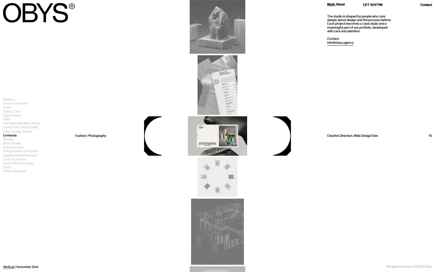
The homepage of this concept-led design studio is a vertical strip of grey project images with a project list on the left, a framed image in the centre and short tags such as Creative Direction and Web Design/Dev on the right. A small switch at the bottom left offers Vertical, Horizontal and Grid views of the work. What to learn: the work is the navigation, and letting visitors choose how to browse it keeps a plain white page interesting. The giant OBYS logo is the only loud element. Visit Obys Agency.
2. Locomotive
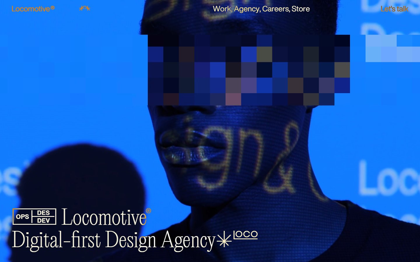
Locomotive is a web and branding agency based in Montreal. Its homepage is one saturated blue photo of a face partly hidden by a block of pixels, with the line Digital-first Design Agency set large in a light serif and a menu limited to Work, Agency, Careers and Store. What to learn: a single strong image and a clear line of type say more than a slider of services. The pixel block is a neat nod to digital work without any literal icons. Visit Locomotive.
3. Dogstudio
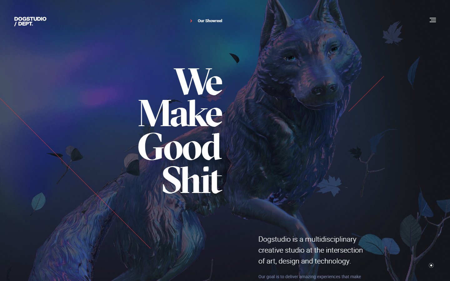
Dogstudio calls itself a multidisciplinary creative studio at the intersection of art, design and technology, and the first screen shows it: a moody wolf sculpture among drifting leaves, a blunt headline in an elegant serif and a Showreel link at the top. What to learn: contrast between a rude headline and a refined typeface gives a studio instant character. It suits clients who want personality; a more cautious brand might soften the wording. Visit Dogstudio.
4. Darkroom Engineering
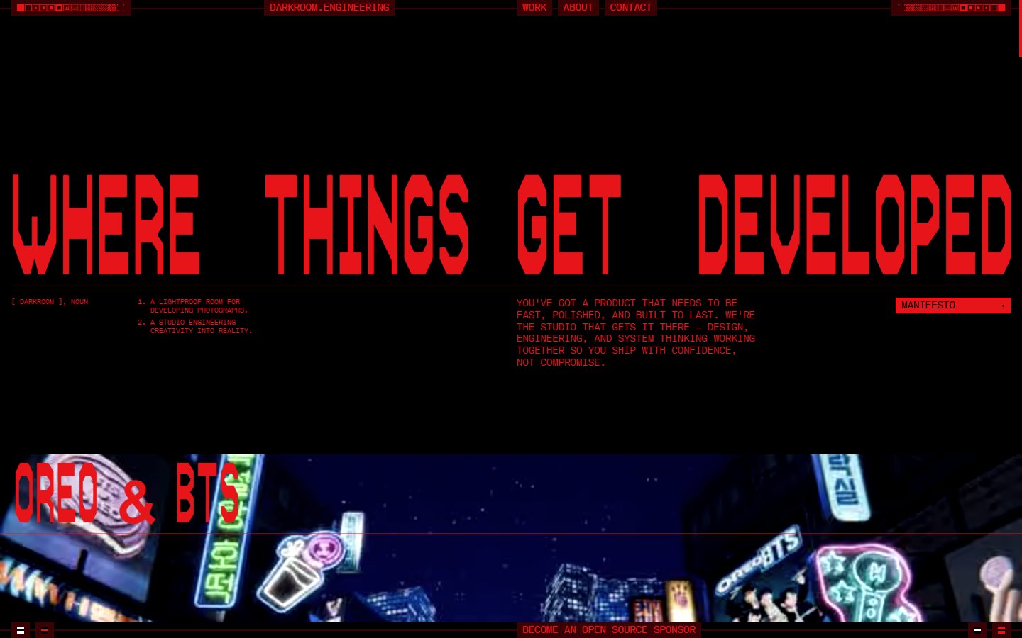
This design and development studio uses one colour on black. The headline Where Things Get Developed is set in huge red pixel-style capitals, with a manifesto button and a strip of project imagery running along the bottom. What to learn: a strict one-colour palette makes a technical studio look like a brand. The caveat is the small red text under the headline, which is hard to read, so keep body copy larger and higher in contrast. Visit Darkroom Engineering.
5. basement.studio
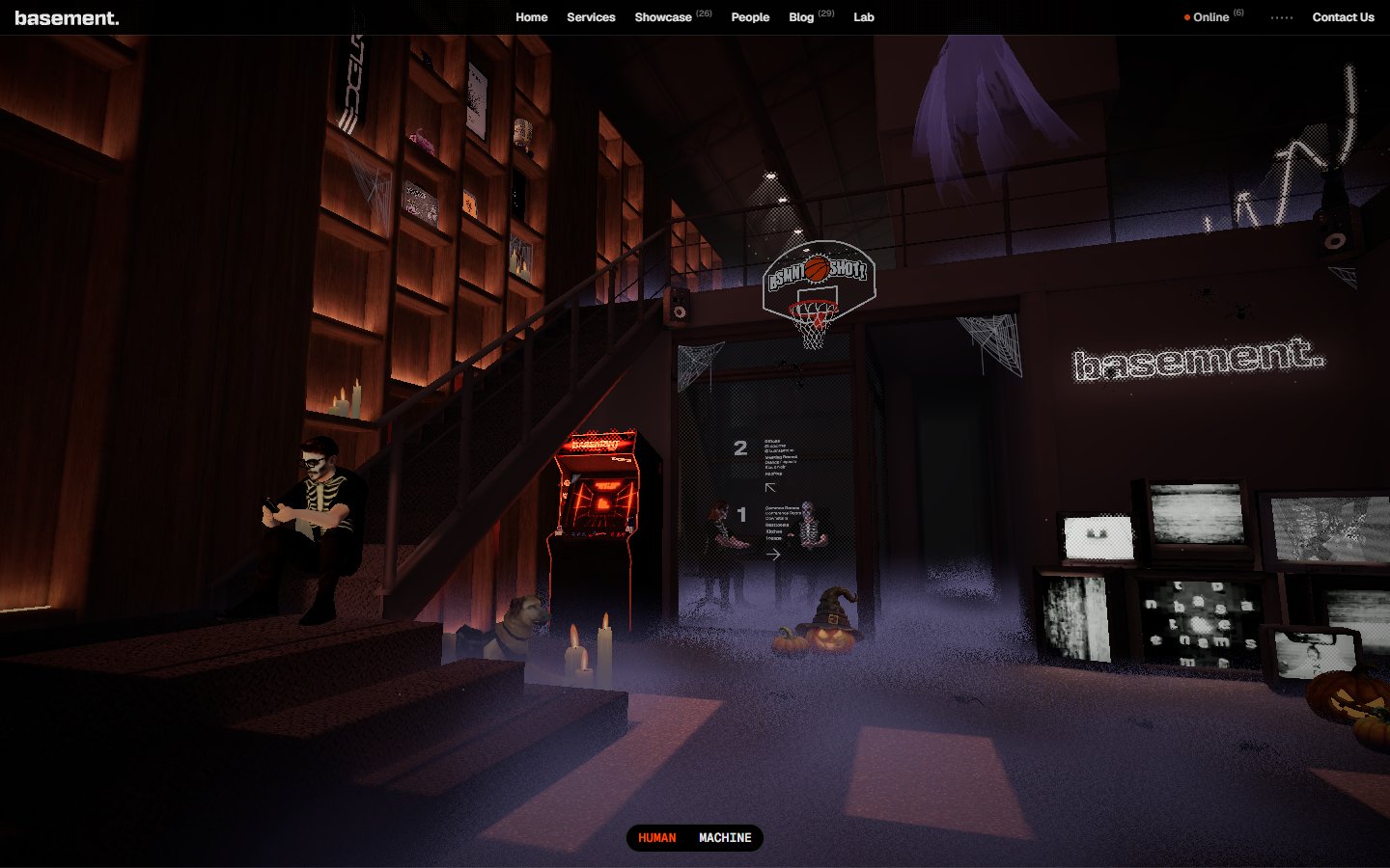
basement.studio is a digital studio, and its homepage is a walkable 3D room: shelves, stairs, an arcade cabinet, a basketball hoop and a glowing basement sign. The usual menu (Home, Services, Showcase, People, Blog, Lab) stays small along the top, and a Human and Machine toggle sits at the bottom. What to learn: a playful world can sit on top of a normal menu, so people who just want the services page still find it. The scene is heavy, so test it on a mid-range phone. Visit basement.studio.
6. Pentagram
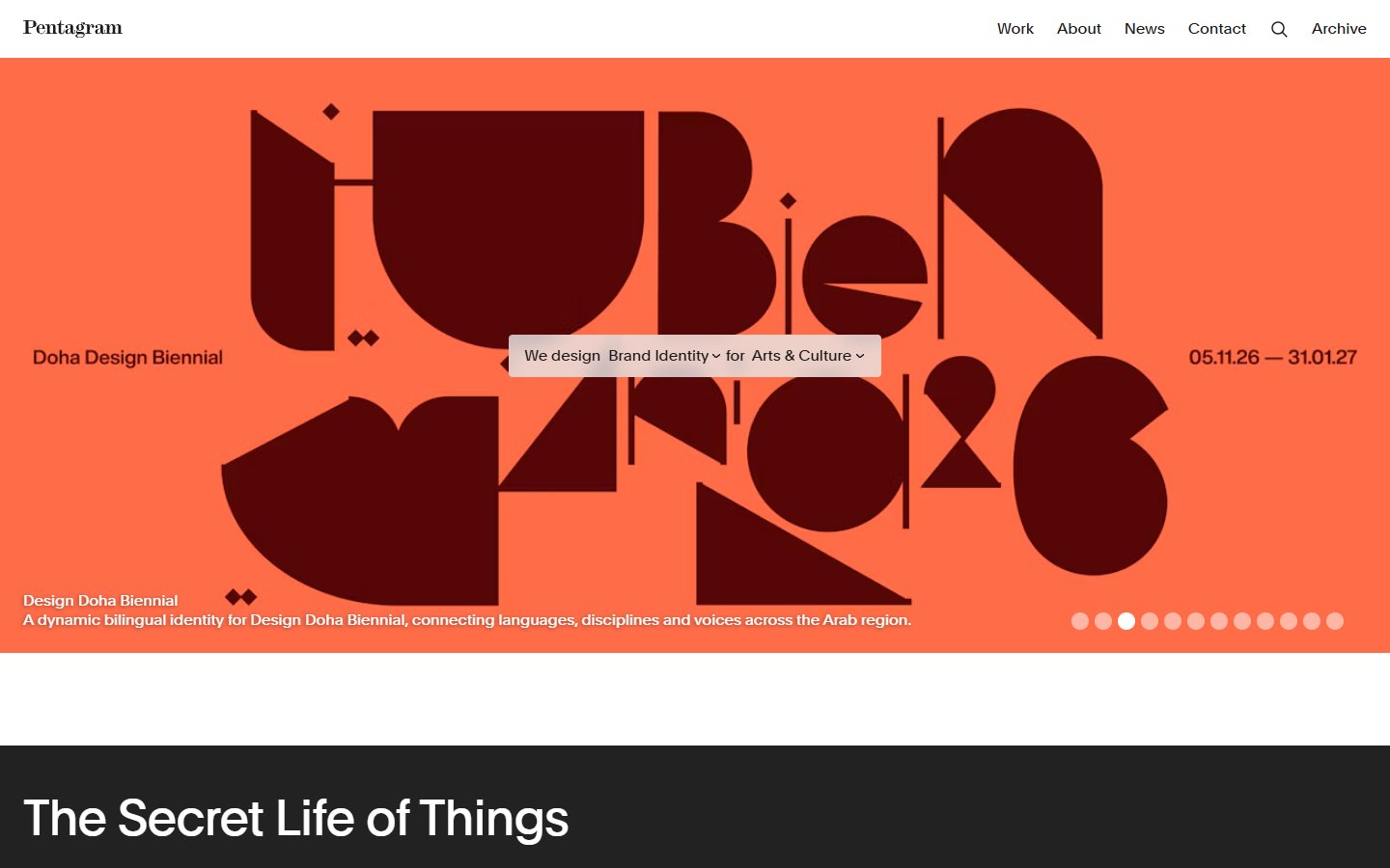
Pentagram describes itself as the world’s largest independent design consultancy, owned and run by its partners. Its homepage is almost all work: one huge panel with a project in full colour, a row of dots for the other featured projects and a plain menu of Work, About, News, Contact and Archive. When we visited, the panel showed a bold geometric identity in dark maroon on orange. What to learn: a confident studio lets the work do the talking, and the page stays calm because the interface is so quiet. Visit Pentagram.
Portfolios
7. Jakub Szerszeń
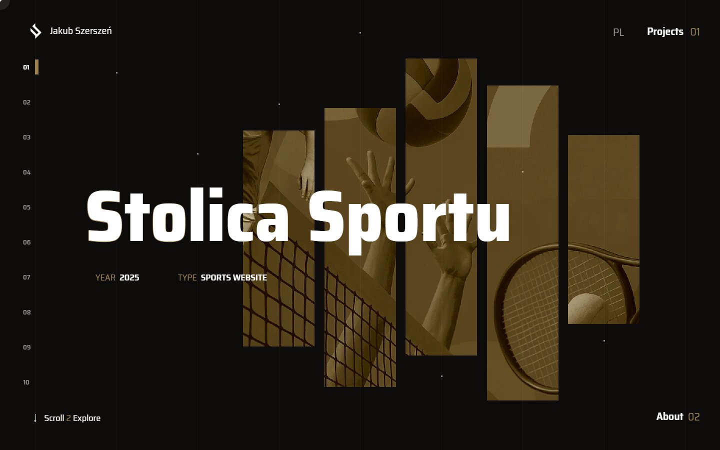
Jakub Szerszeń is a front-end developer from Warsaw, and his portfolio is a dark, numbered showcase. Each project gets a huge title, a year and a type, with the project image cut into tall tinted slices behind it and a list from 01 to 10 down the left. Projects and About sit in the corners, and a Scroll to Explore hint is at the bottom. What to learn: one project per screen focuses attention, and the tint keeps very different projects looking like one portfolio. The tiny labels are hard to read, so make key links bigger. Visit Jakub Szerszeń.
8. Longshot
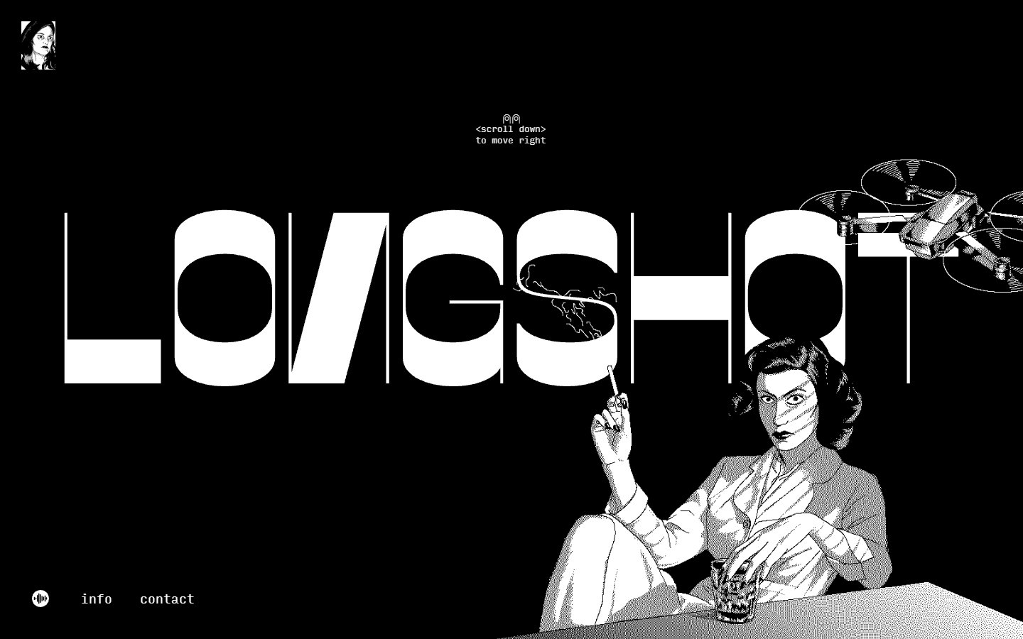
Longshot Features is a film production company founded by Joe Talbot, Jimmie Fails and the team behind The Last Black Man in San Francisco. The site is black with an oversized white wordmark and a black and white drawing of a woman at a table, with a drone flying across the top. A line of small text says to scroll down to move right. What to learn: one illustration and one huge wordmark can carry a whole brand. Sideways scrolling takes a moment to learn, so a clear hint like this one is essential. Visit Longshot.
Brand and story websites
9. Bud
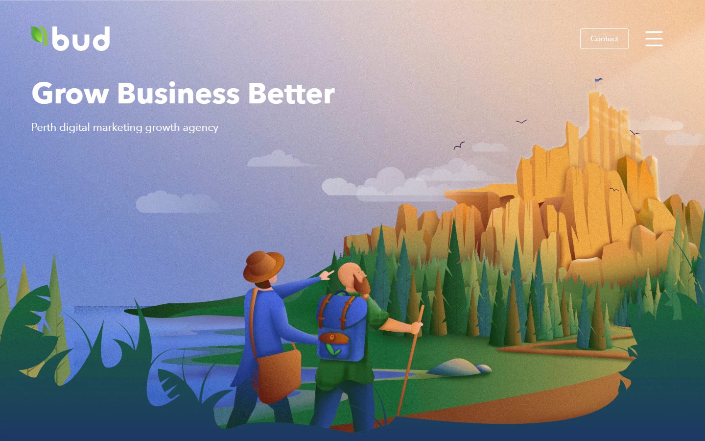
Bud is a digital marketing agency in Perth. Its homepage opens with a layered illustration of two hikers looking up at a golden rock formation and the line Grow Business Better, over a soft purple and blue sky. What to learn: custom illustration makes a service business memorable, and the hiking scene matches the idea of growing step by step. The menu is hidden behind an icon even on desktop, which is tidy but hides the services from people in a hurry. Visit Bud.
10. Mohasky

Mohasky is a concept for a cannabis delivery and education app for New Zealand, so treat it as a design exercise. The homepage is one flat green with two big leaves either side of a rounded white wordmark, a row of dots at the top that tracks your progress and a faint Scroll prompt at the bottom. What to learn: one colour and one object are enough for a strong first screen. The Scroll prompt is very faint, so give important prompts more contrast. Visit Mohasky.
11. Niki Lauda
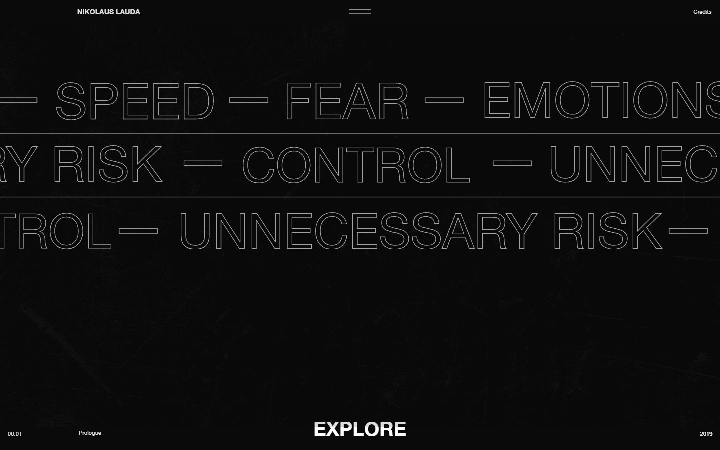
This biography of the racing driver Niki Lauda lives on the Obys Agency domain. A grainy black page is filled with huge outlined words such as Speed, Fear, Emotions, Control and Unnecessary Risk, a label shows you are in the Prologue and a white Explore label invites you in. What to learn: pick the few words that define a subject and make type the visual. The outlines keep the page light while the dark grain feels like film. Add a visible skip option for a story this long. Visit Niki Lauda.
12. Weird Christmas
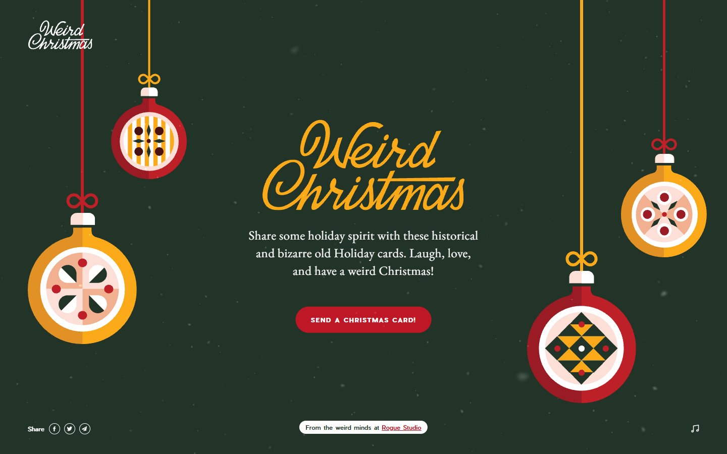
Rogue Studio made Weird Christmas as a playful side project: a dark green page with hanging baubles in red, yellow and cream, a hand-lettered title and a red button to send a card. Share icons sit at the bottom left and a music icon at the bottom right. What to learn: a small, finished campaign shows a studio’s personality better than a long about page. As it is a holiday site, it works best as a yearly campaign, and sound should stay under the visitor’s control. Visit Weird Christmas.
What to take from these creative websites
Creative sites are inspiration, not templates. A few ideas transfer well to everyday client work:
- Lead with one strong image or line. Pentagram, Locomotive and Bud all use a single idea on the first screen. See our notes on hero images.
- Show the work early. Obys and Jakub Szerszeń put projects first and services second.
- Keep one familiar way in. basement.studio has a 3D room and a normal menu, which is the safest mix. Read more on website navigation.
- Give people a restful moment. Pages with a lot of movement need quiet areas, which is why visual hierarchy matters even on the wildest site.
- Treat motion as a cost. Anything that animates or uses 3D has to be tested for speed and accessibility. Our web design tips for SEO explain why.
If you like sites you can play with, see our list of interactive websites to study. If you are choosing a partner for a build like this, read how to choose a web design agency, or start from our free designer portfolio template.
Tips for designing a creative website
- Decide the one thing a visitor should remember. Build the first screen around it.
- Make the work easy to open. Every project needs a clear link to a full case study.
- Keep text readable. Check size and contrast on a laptop and a phone, as several sites above fall short here.
- Plan for slow connections. Show a still image while 3D or video loads.
- Respect reduced motion. Offer a calmer version for people who turn animation off.
- Make contact obvious. A creative homepage still needs a way to start a project.
Frequently asked questions
What is a creative website?
A website where the design itself is part of the message, usually for a studio, an artist or a brand. It often uses bold type, custom illustration, motion or an unusual layout to show what the maker can do.
How do I make my website more creative?
Start with one strong idea for the first screen, such as an illustration, a bold line of type or a short video. Keep the navigation familiar and the text readable, and add motion only where it helps the story.
Are creative websites bad for SEO?
Not by default. Problems start when text sits inside images or scripts, or when heavy animation slows the page. Keep headings, copy and links in plain HTML and load the effects after the main content.
Where can I find more creative website examples?
Award sites such as Awwwards and The FWA feature new work daily. Check any winner on a phone before borrowing its ideas.
Need a creative website for a client?
Inkyy is a white label design and development team for agencies. We design and build distinctive websites that stay fast and easy to use, and you deliver them under your own brand. See our design services or book a 15-minute call.