15 Interactive Websites to Study: 3D, Scroll and Sound
 10 min read
Interactive websites turn a page into something you can play with: drive a car through a portfolio, scroll down to the bottom of the ocean or tap a soundboard. The best ones are more than tricks: every interaction helps tell the story. That makes them worth studying even for a plain business site.
Below are 15 live interactive websites, grouped by the kind of interaction they use. For each one we say what you can do, what to learn and, where it matters, the performance or accessibility cost. Then we look at when interactive design helps a business site and when it gets in the way.
What makes a website interactive?
Every website reacts to clicks. An interactive website goes further: what the visitor does shapes what they see. Most examples below use one or more of these techniques:
- WebGL and 3D. Real-time 3D scenes in the browser, usually built with Three.js.
- Scroll storytelling. The scroll bar becomes a timeline and the page changes as you move down. It works best when planned like a storyboard.
- Sound. Audio that reacts to taps or keys. It must always be optional.
- Direct manipulation. Sliders, drag handles and toggles that change a diagram or model at once.
All of these cost something. 3D scenes load slowly and drain phone batteries, motion can make some people feel unwell, and custom controls often break keyboard and screen reader access.
15 interactive websites worth studying
Every site below was live when we checked it, screenshotted on desktop at 1440 by 900 pixels. For more general ideas, see our top 30 web design examples.
3D and WebGL worlds
1. Bruno Simon
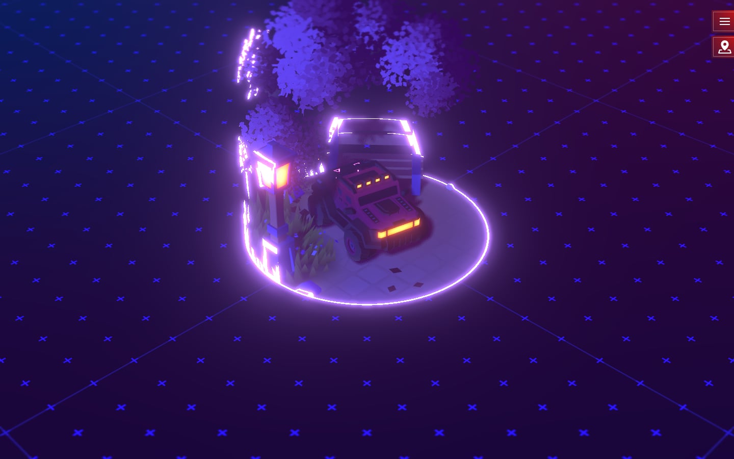
Creative developer Bruno Simon’s portfolio is a small game. You drive a red off-road car around a 3D world built with Three.js, and the projects, links and hidden extras are found in the world, not in a menu. The scene appears inside a glowing circle while the rest loads. What to learn: a portfolio can show skill instead of describing it. The caveat: the car is the navigation, so busy recruiters need a plain fallback, and the site works a laptop hard. Visit Bruno Simon.
2. Lusion
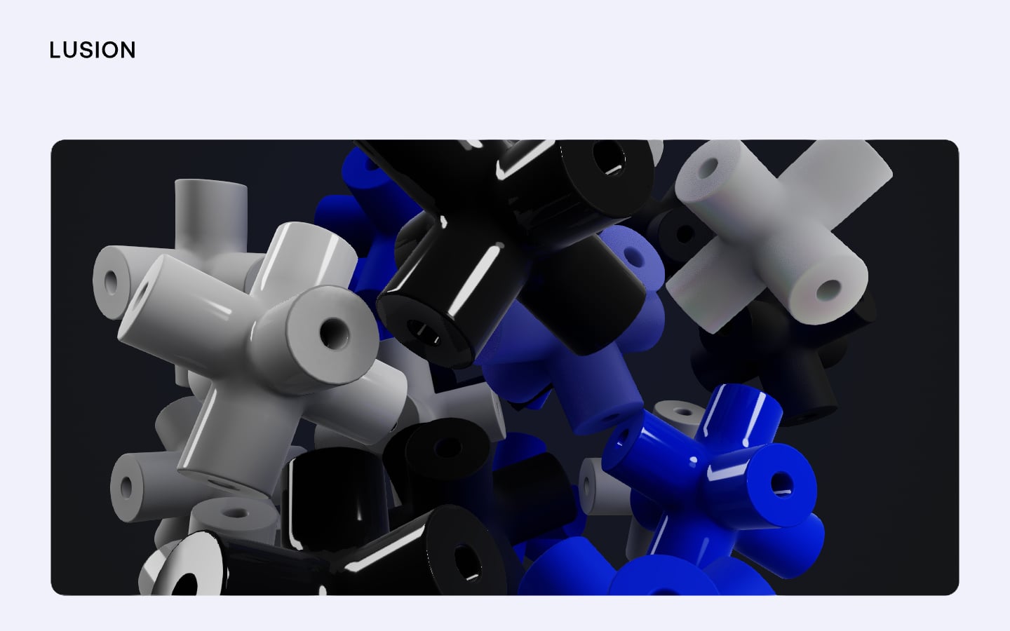
The 3D studio Lusion opens its homepage with a pile of glossy tube shapes in white, black and electric blue inside a dark rounded panel. Everything around it is calm: a pale background, a one-word logo and plenty of space. What to learn: one strong 3D moment in a quiet layout looks more confident than 3D everywhere. Show a still image while the scene loads, so the first screen is never empty. Visit Lusion.
3. Igloo Inc
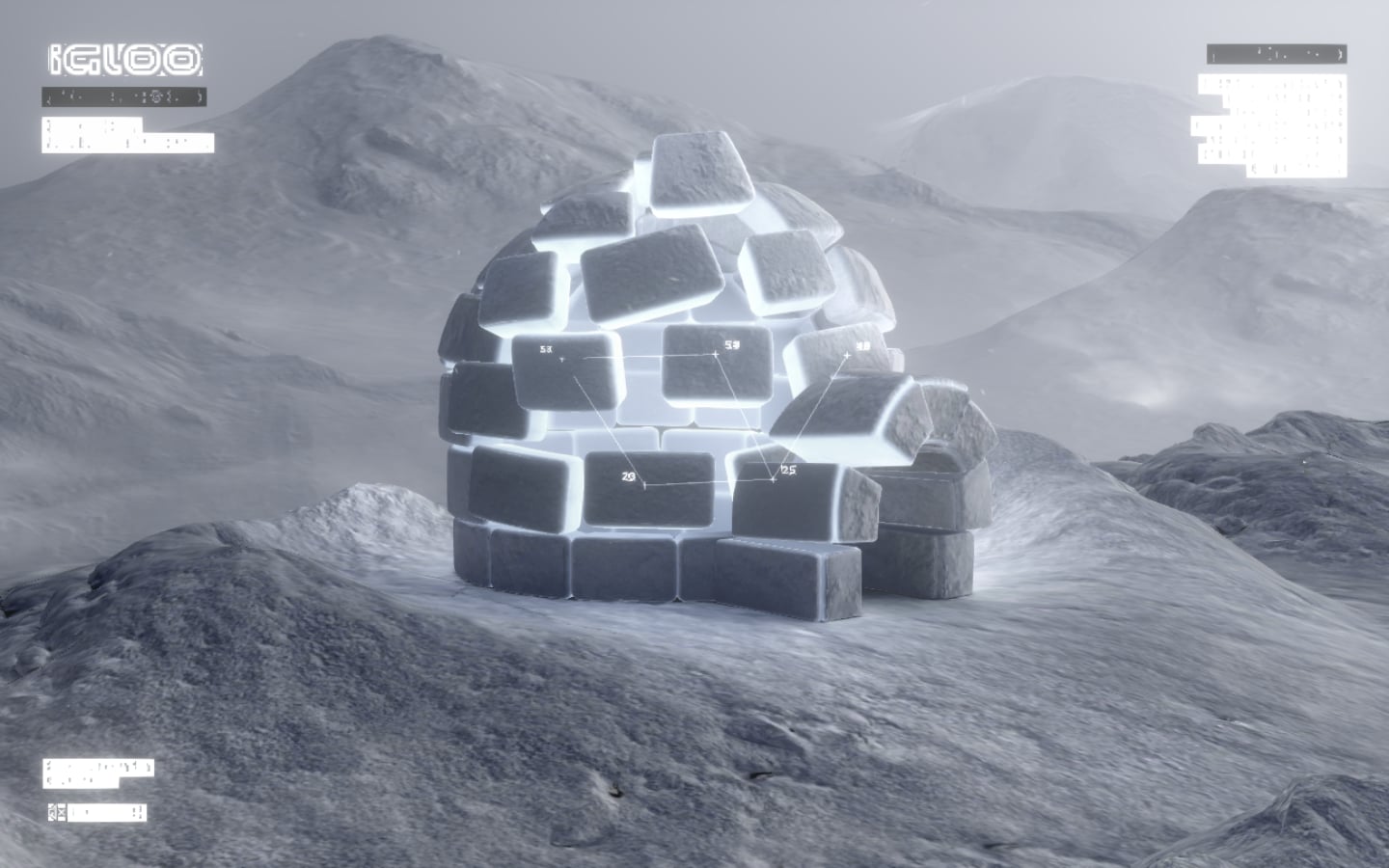
Built by the studio Abeto and an Awwwards Site of the Day, Igloo Inc’s site is a cold, grey 3D world: an igloo of glowing ice blocks on a snowy mountain, with glitchy text panels in the corners. Scrolling does not move down a page; it takes you on to new 3D scenes, such as a floating block of ice. What to learn: a strict palette makes a heavy 3D world feel like a brand. The caveat: the tiny corner text is hard to read. Visit Igloo Inc.
4. Messenger by Abeto
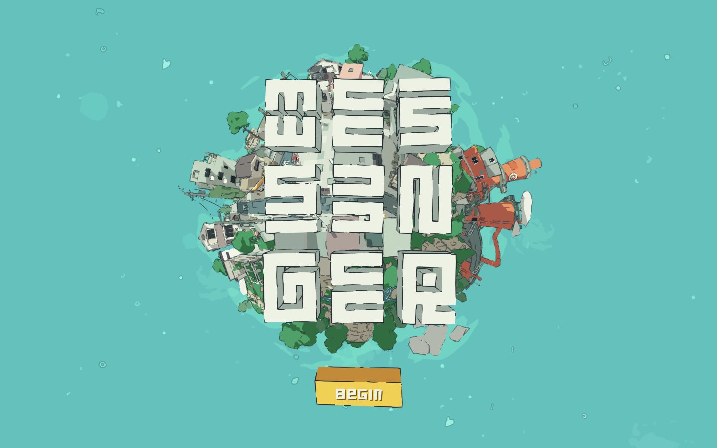
Also from Abeto, Messenger is a free browser game in which you deliver mail around a tiny planet, shared with other players. The title screen shows the planet crowded with houses and trees, the name in chunky block letters and one yellow Begin button. It runs on WebGL with nothing to install. What to learn: a single, obvious start button is the best onboarding there is. Visit Messenger.
Interactive explainers
5. NASA Eyes on the Solar System
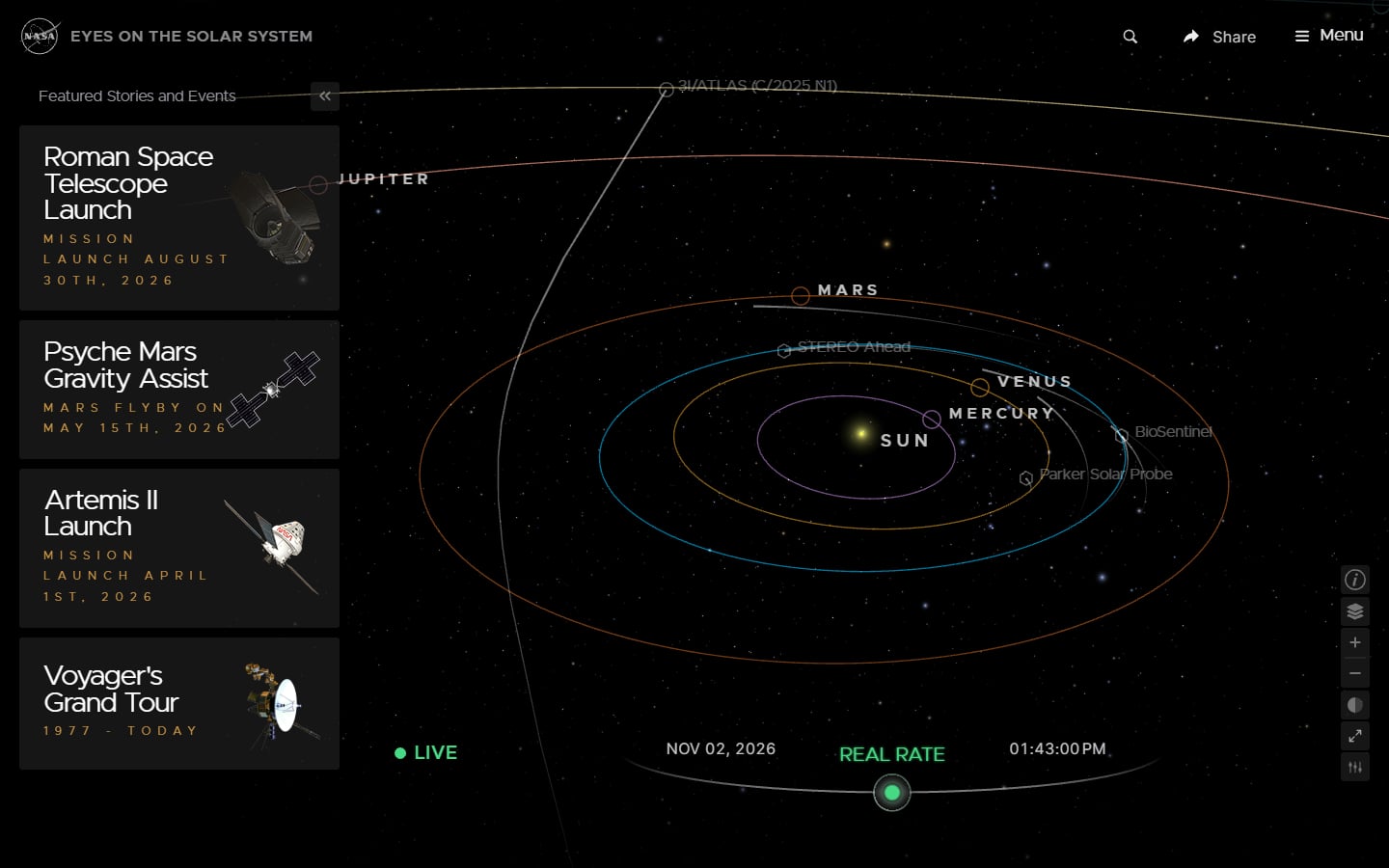
NASA’s Eyes on the Solar System is a real-time 3D model of the solar system. You can zoom from the Sun to a single spacecraft, a time control runs the model live or faster, and cards on the left jump to featured missions. What to learn: complex data makes sense when people can move around it, and the cards give newcomers a way in. The caveat: on older phones the 3D view is slow, so key facts should also exist as text. Visit NASA Eyes on the Solar System.
6. Bartosz Ciechanowski: Moon
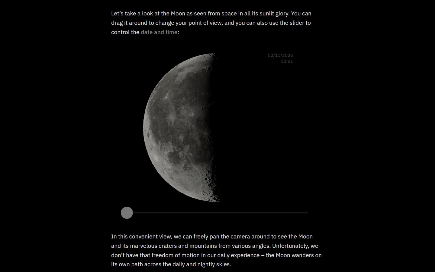
Bartosz Ciechanowski writes long explainers about how things work, full of small interactive demos. In his article on the Moon, you drag a 3D Moon to change your point of view and use a slider to change the date and time. What to learn: interaction works best when it answers a question the text has just raised. The plain layout leaves all the attention for the demos. Visit Moon by Bartosz Ciechanowski.
Scroll storytelling
7. Fishing the Feed
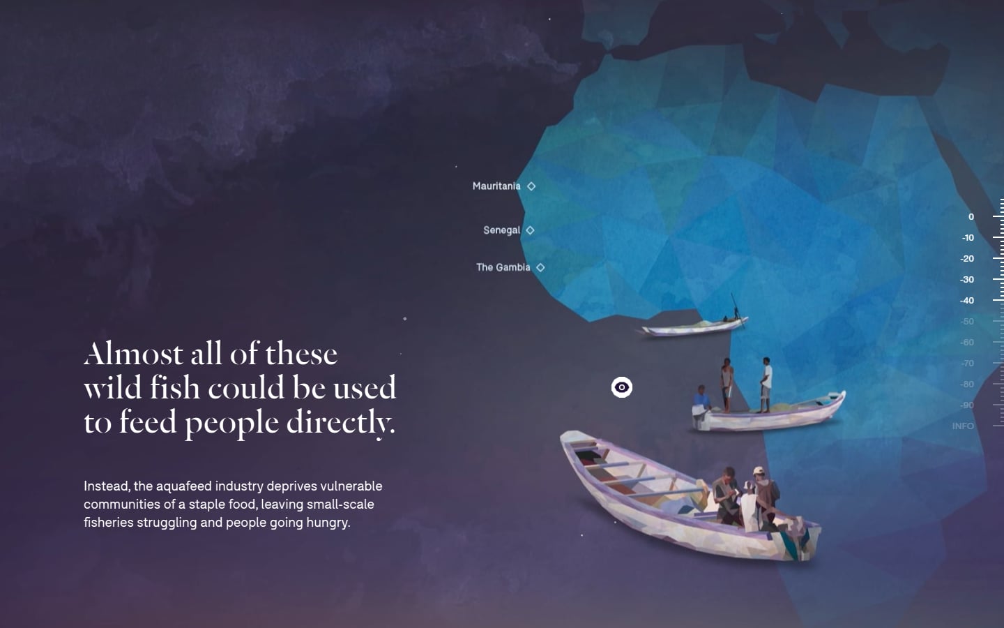
Fishing the Feed, from the Changing Markets Foundation, explains how farmed fish are fed with wild-caught fish. You scroll down through the water while a depth gauge on the right tracks your progress, and low-poly illustrations of shoals, nets and boats off West Africa change with each point. What to learn: sinking into the sea is a metaphor everyone gets at once. Offer a reduced-motion version for people who turn animation off. Visit Fishing the Feed.
8. The Boat
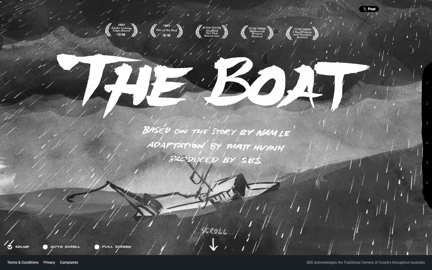
The Boat is an interactive graphic novel from the Australian broadcaster SBS, based on a story by Nam Le and adapted by artist Matt Huynh. It tells of an escape by sea after the Vietnam War, with ink drawings, rain and sound that move as you scroll. What to learn: toggles for sound, auto scroll and full screen hand control back to the reader, which is good practice on any story site. It is long and heavy, so it suits a story people choose to sit down with. Visit The Boat.
9. The Deep Sea by Neal.fun
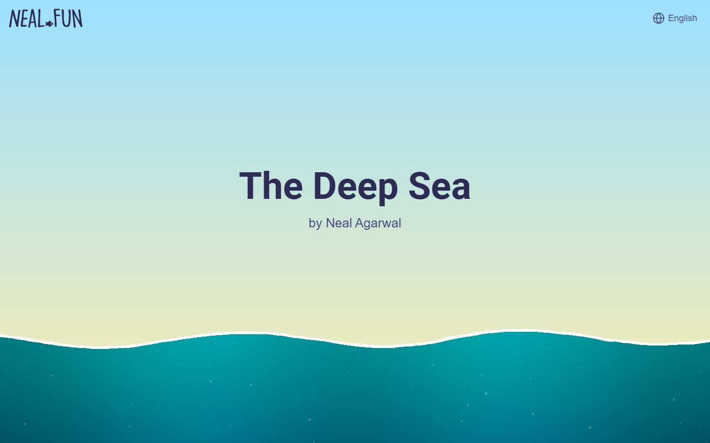
Neal Agarwal’s The Deep Sea starts with a sky, a title and the surface of the ocean. Scroll and you sink past labelled animals and zones such as the Twilight Zone to the sea floor, while a counter shows how many metres deep you are. What to learn: the scroll bar becomes a measuring stick, so you feel the depth instead of reading it. It is light and works well on a phone, proof that scroll storytelling does not need heavy 3D. Visit The Deep Sea.
10. The Pudding
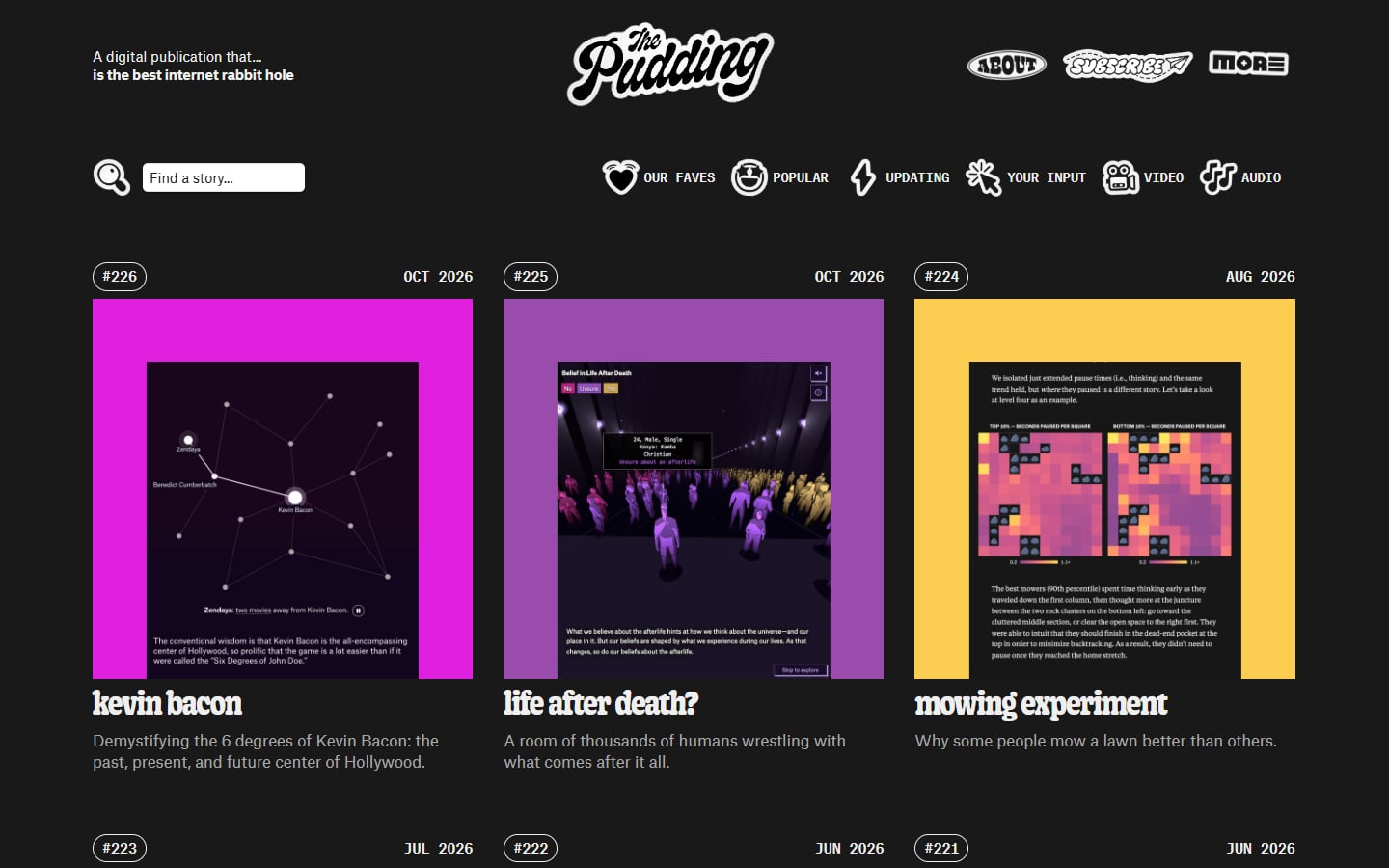
The Pudding publishes visual essays that explain culture with data, built around scrolling charts, maps and small games. The homepage is a grid of numbered story cards in loud colours under a hand-drawn logo. What to learn: each essay has its own look but a familiar structure, so readers know how to move through it. If you need to present research or survey results, study this one. Visit The Pudding.
Sound and play
11. Noiz! by Resn
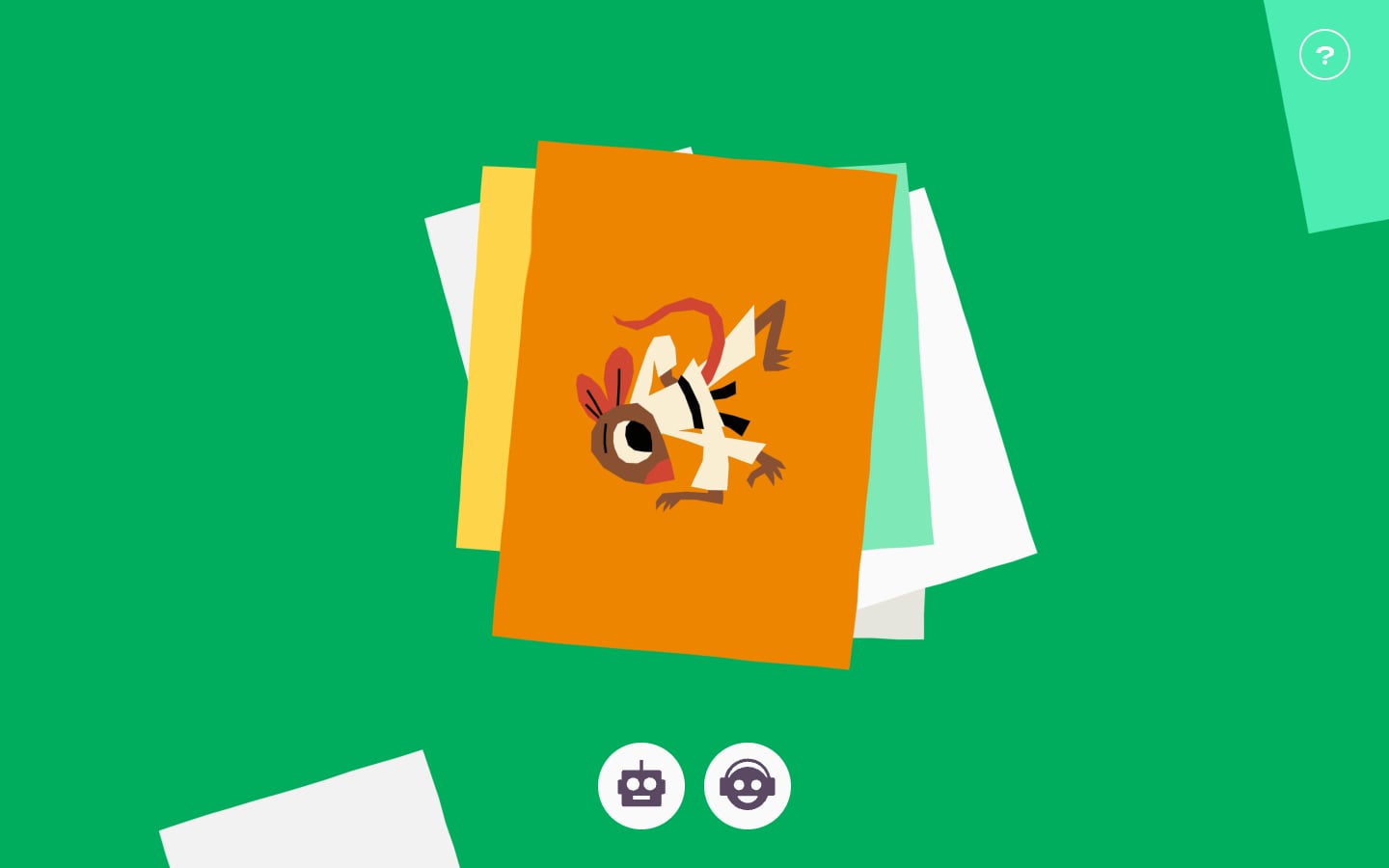
Noiz! is a set of seven silly soundboards that the agency Resn made for HEIHEI, a New Zealand children’s platform. A stack of bright paper cards with cartoon characters leads into the soundboards, which you play in Free Play or Challenge mode, with instructions in English and te reo Māori. What to learn: flat shapes and big round buttons suit small hands. Sound is the point here, but on most sites it should stay off until the visitor asks for it. Visit Noiz!.
12. Chrome Music Lab
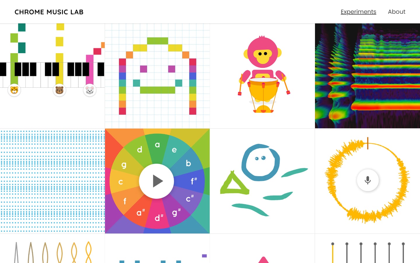
Chrome Music Lab is a set of music experiments from Google, built with open web technology such as the Web Audio API. The homepage is a grid of bright tiles: a piano roll song maker, a chord wheel, a drumming monkey, a spectrogram and more. What to learn: each tile previews the tool behind it, so people choose by sight, and each experiment does one thing, which keeps it simple enough for a classroom. Visit Chrome Music Lab.
Interaction on commercial sites
These sites sell something, so the interaction is lighter and always supports the product. They are the most useful models for a client project, along with the best SaaS website designs.
13. Apple AirPods Pro
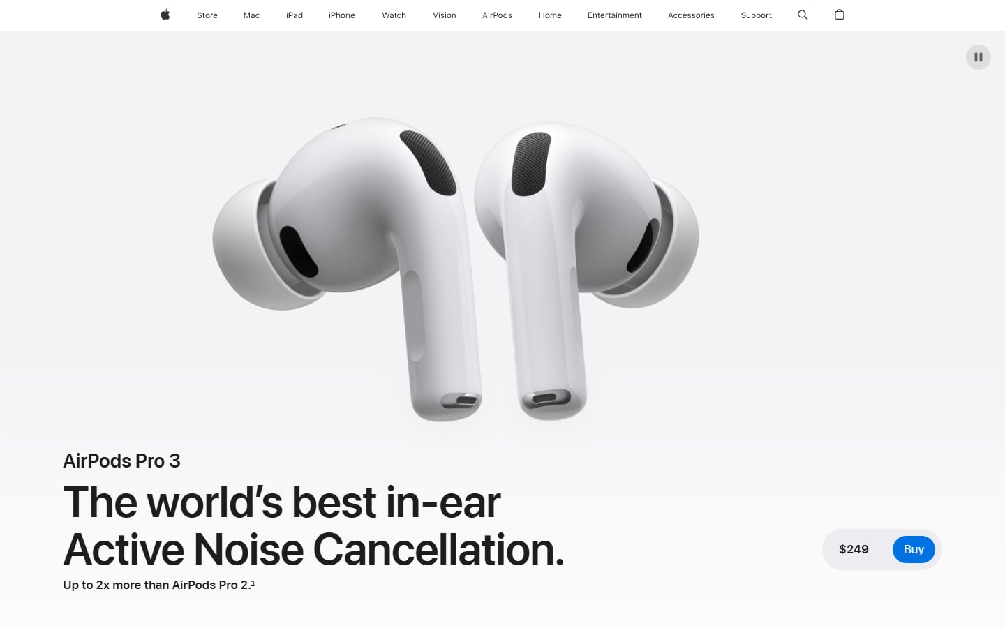
Apple’s product pages are the best-known example of scroll-driven product storytelling. On the AirPods Pro page, the earbuds fill the first screen with a short headline and a small price and Buy button. Further down, a feature explorer opens topics such as sound quality, fit and the charging case one at a time. What to learn: let the product move, keep the words short and keep the buy button in reach. Every section must still make sense when someone scrolls fast. Visit Apple AirPods Pro.
14. Stripe
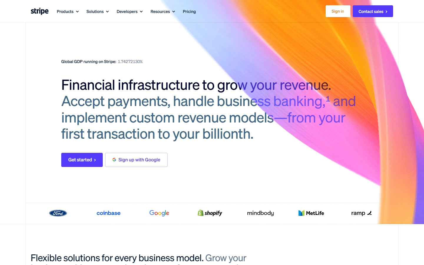
Stripe shows how much a little motion can do. A flowing ribbon of orange, pink and purple sits behind a clear headline, two buttons and a row of customer logos, with a small live counter of the share of global GDP running on Stripe. The rest is a normal, fast page. What to learn: keep motion in the background and the message and actions in plain HTML, so the page works even if the animation does not. Visit Stripe.
15. Editorial New
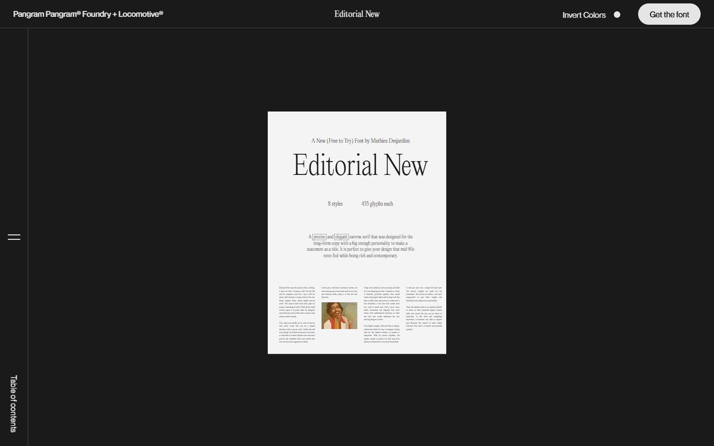
Editorial New is a serif typeface from Pangram Pangram Foundry, and its specimen site was made with the Montreal agency Locomotive. The font is set as a printed page you can explore, with a table of contents, an Invert Colors toggle and an always visible Get the font button. What to learn: a product page can be an experience and still keep a clear path to buy. See our font pairing tips for more on type like this. Visit Editorial New.
When interactive design helps a business site, and when it hurts
Most businesses need a site that loads fast, ranks in search and brings in enquiries. Interaction helps when it does one of these jobs:
- It explains something hard. A configurator, pricing calculator or before and after slider answers questions faster than a paragraph.
- It is the product. Studios, developers and type foundries sell craft, so the site is the portfolio.
- It is a campaign. A launch or a report with a set lifespan can afford a heavier build.
- It makes people stay with data. Scroll stories like Fishing the Feed hold attention better than a PDF.
It hurts when it gets between the visitor and the task:
- Slow first load. A big 3D scene or long intro delays the first screen and hurts Core Web Vitals.
- Hidden content. Text inside a canvas or behind an interaction is hard for search engines to read. Keep key content in HTML, as our web design tips for SEO explain.
- Unusual navigation. If people have to learn how to move around, many will not. Keep a normal menu (see our guide to better website navigation).
- Motion and sound that cannot be stopped. Respect the prefers-reduced-motion setting, never autoplay sound, and make every control work with a keyboard.
A useful test: without the interaction, would the page still make sense and still sell? If not, build the plain version first and add the interaction on top. Our real estate website design guide shows map search and galleries that stay interactive without slowing the site down.
Tips for designing interactive websites
- Start with the story. Decide what the visitor should understand or do, then pick the one interaction that helps most.
- Storyboard every scroll step before anyone writes code.
- Show something at once. Use a still image or simple first frame while 3D assets load.
- Set a performance budget. Agree on page weight and load time, then test on a mid-range phone with mobile data.
- Design a fallback. Plan what people see with reduced motion, an old device or a screen reader.
- Keep one clear action. The way to buy, book or get in touch must stay visible.
Frequently asked questions
What is an interactive website?
A website that responds to what the visitor does, not just to link clicks: 3D scenes you can move around, scroll-driven animation, sliders that change a diagram or sound that plays when you tap.
How do you make a website interactive?
With JavaScript on top of HTML and CSS. Common tools are Three.js for 3D, GSAP or CSS scroll-driven animations for scroll effects and the Web Audio API for sound. Webflow and Framer offer scroll and hover interactions without code.
Are interactive websites bad for SEO?
Not by default. Problems start when content lives only inside a canvas or a script, or a heavy intro slows the page. Keep text and links in HTML and load the interactive parts after the main content.
Where can I find more interactive website examples?
Award sites such as Awwwards and The FWA feature new interactive websites every day. Check how a winner performs on a phone before you borrow an idea.
Need an interactive website for a client?
Inkyy is a white label design and development team for agencies. We design and build websites with scroll animation, 3D product views and interactive tools that stay fast and accessible, and you deliver them under your own brand. See our design services and development services, or book a 15-minute call.