


20 Star Logo Ideas: Minimal, Celestial, Badge and Playful
 9 min read
A star logo is one of the quickest ways to say quality, guidance or ambition. The shape is known everywhere, from rating systems to flags, which is also the challenge: a plain five-point star is so common that it needs a clear idea behind it to stand out.
Below are 20 star logo designs grouped by style: minimal and gradient stars, celestial and night-sky marks, sports and badge logos, and playful stars. For each one we note what works and what kind of brand it suits, then finish with practical tips for designing your own.
What a star logo says about a brand
- Quality and excellence: we read stars as ratings and awards, so they suit reviews, hotels, schools and premium services.
- Guidance and hope: sailors navigated by the stars and we still talk about a guiding star. A good fit for travel, coaching, education and charity brands.
- Ambition and energy: bright, sharp stars work for entertainment, talent, events and fast-growing startups.
- Wonder and calm: stars with a moon or a night sky feel dreamy, which suits kids’ products, sleep, wellness and gifts.
- Strength and authority: stars appear on team crests and on military and tactical emblems, so they carry weight in sports and security.
There are a few traps. A plain five-point star is used by countless brands, so similar marks are easy to run into, and it is worth searching trademark records before you commit. A red star can carry political or military associations in some regions. A star inside a circle can also be read as a pentagram. Finally, thin star points disappear at small sizes, so keep the shape bold.
20 star logo ideas by style
Minimal, gradient and line star logos
Clean geometry, bright gradients and single-line construction. These are the most common star logos for tech, media and startup brands.
1. Blue Star
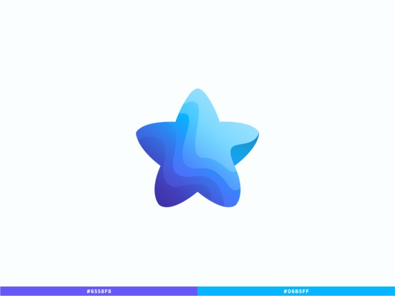
A soft five-point star with rounded tips and wavy layers of blue and purple that suggest folded paper or water. The two colour swatches under the mark show how little palette it needs. A friendly choice for an app, a learning platform or a kids’ service. Design by Logo Supra.
2. Star
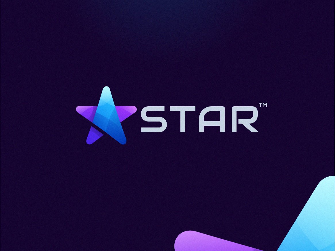
The star is built from angled planes in purple and blue, so the points look folded. Next to a wide, spaced wordmark it feels technical and modern. This suits a software product, a gaming brand or a media platform that wants a dark, polished look. Design by alon_kelakon.
3. Aranno
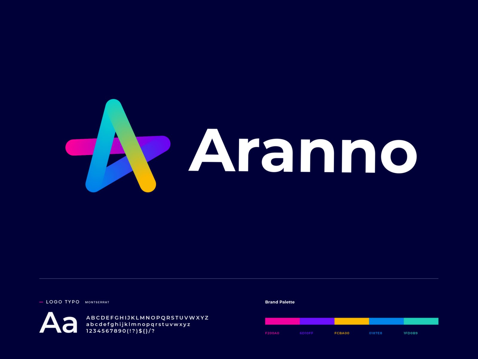
The star is one looping line in pink, purple, blue and yellow that also hints at the letter A. The presentation shows the typeface and palette, so the logo feels like part of a system. Right for a fintech, a creative tool or any brand that wants energy without clutter. Design by Md Rasel.
4. StarTalk
Five rounded pieces in orange, pink, purple, blue and teal leave a star-shaped gap in the middle, and the pieces read like speech bubbles. That fits the name and a chat or community product. It is shown on navy and white, which proves the colours hold up on both. Design by Vadim Korotkov.
5. Shooting Star
A tilted star with a trail of dots in blue and teal gives instant movement. The small version on the purple strip shows it still works as an app icon. A good choice for a launch platform, a talent app or a startup that wants to feel fast. Design by David Kovalev.
6. Interlocking star
Two parallel lines weave over and under each other to form a star, like a knot. One colour and one line weight keep it clean and easy to emboss or engrave. It suits an agency, a financial brand or a premium product with a craft angle. Design by Omnium.
7. Code Star
The star outline is split into five separate strokes, each in its own colour, with gaps where the lines meet. The open shape feels light and active, and the plain lowercase wordmark keeps it professional. A good fit for a developer community or a training brand. Design by Logo Positive.
8. All Positive Energy
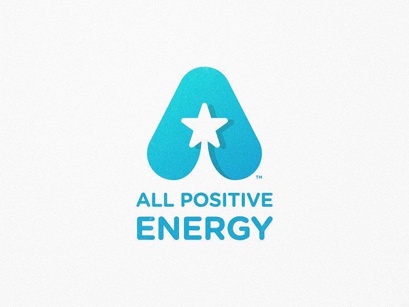
A small white star sits inside a rounded blue letter A, so the star works as a spark and the initial at the same time. The wordmark echoes the same blue. A tidy approach for a wellness brand, a coaching service or an energy supplier. Design by Adolfo Teixeira.
Celestial and night-sky star logos
Moons, constellations and starry skies. These logos lean on mood, so they suit brands that sell calm, magic or a sense of occasion.
9. 7 Star Jewelry
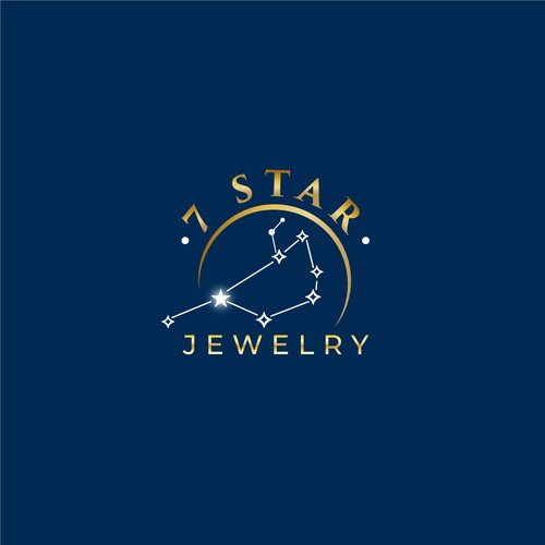
Seven stars joined by fine lines form a constellation under a thin golden arc. Gold on navy is a classic luxury pairing, and the line work feels precise like a jewellery setting. A natural fit for a jeweller, a watch brand or a gift boutique. Design by Elite Craters on 99designs.
10. Golden Hour Girls
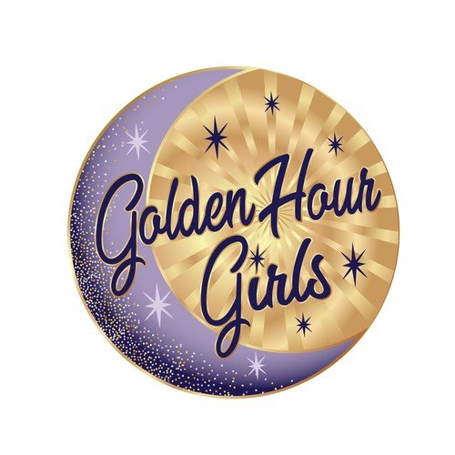
A gold sunburst and a purple crescent with sparkling stars sit behind bold script lettering. It has a vintage badge feel, almost like an enamel pin. A good fit for a social club, a vintage shop or an events brand with a retro touch. Design by Diggitigirl on 99designs.
11. On the Verge Organics
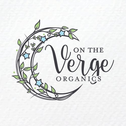
A crescent made of a leafy vine, with a few blue stars among the leaves, wraps around an elegant script wordmark. It joins plant and night-sky imagery in one soft shape. Well suited to natural skincare, tea or herbal products. Design by AleksandraPekic on 99designs.
12. Over the Moon
A dark, hand-painted circle holds a crescent, a star and a scatter of tiny sparkles. The typewriter wordmark underneath is small and quiet. A lovely direction for a children’s workshop, a bookshop or a handmade gift brand. Design by Wanderleaf Design on 99designs.
13. Lighthouse Star
A lighthouse is cut out of a yellow star, with tiny sparkles at the sides, so the star becomes the guiding light. One colour on black keeps it bold. It would suit a coaching business, a maritime brand or a charity that wants to say guidance. Design by Daniel Bodea.
Sports, badge and tactical star logos
Bold outlines, shields and heavy shapes. Stars work well here because they already feel like rank and achievement.
14. FS21 Baseball
A large star with thick outlines carries the team name in sporty lettering, with a player silhouette and a baseball tucked in. The layered black, grey and blue make it look strong on jerseys and caps. It was made for a baseball training brand, and it would suit any team that wants a loud, confident look. Design by indraDICLVX on 99designs.
15. The LGCY Masters
A navy and gold shield with vertical stripes and small stars. The stars are secondary here, which proves they do not have to be the hero to add a sense of rank. A strong template for a league, a school team or a club. Design by Randys on 99designs.
16. Orion Tactical
A concave four-point star sits inside a broken oval ring, in dark red on black. The cut ring feels like a scope or a target, and the sharp points feel precise. It was made for a maker of tactical products, so it suits outdoor gear, security and equipment brands. Design by CrimaDezignz on 99designs.
Playful star logos
Rounded shapes, characters and bright colours. Here the star is a sparkle, not a rank.
17. Toy Stars
Fat blue and yellow letters with a dark outline, and small stars scattered around the name. Primary colours and bold shapes make it easy to read from a distance, such as on a shopfront or a packaging box. Made for an online toy store. Design by brandphant on 99designs.
18. Tiny Dreamer Shop
A smiling pale blue cloud with a few yellow stars sits above thin handwritten lettering. The pastel palette is gentle and suits a nursery. It was made for a shop selling children’s room decor, and it would also suit baby gifts and sleep products. Design by Havrydesign on 99designs.
19. Otter and Rocket
An otter hugs a small rocket while floating in water, with a crescent moon and a few sparkles behind. The stars here set the mood instead of leading the logo. A good model for a mascot brand with a bit of storytelling, such as a kids’ show, a game studio or a toy line. Design by Alexandru.S on 99designs.
20. Space Dog

A dog head in one dark teal colour wears a planet ring like a collar, with two four-point sparkles beside it. The silhouette is simple and friendly. It would suit a pet brand with a playful side, a kids’ app or a space-themed game. Design by Musique! on 99designs.
Tips for designing a star logo
- Decide what the star means. Quality, guidance, fame and wonder lead to very different designs. Write the meaning in one line before you draw.
- Break away from the default five-point star. Rounded tips, folded planes, ribbons and negative space all make a star feel specific. StarTalk and Aranno above both avoid the standard shape.
- Give the star a second job. The best examples here hide a letter, a lighthouse or a speech bubble inside the star. One extra idea is enough.
- Test it small and in one colour. Check the logo at 32px, in black on white, and without gradients. If the star turns into a blob, thicken the points.
- Choose colours with intent. Gold and yellow say quality and warmth, and blue and purple say technology and space. Our guides to yellow and purple in branding go deeper.
- Plan the variations. You will need a full logo, an icon-only star and a one-colour version. Here is how to plan logo variations.
Looking for more ideas? See our collections of crown logos, esport mascot logos and warrior logos, or read the key principles of logo design. You can also see our full range of design services.
Frequently asked questions
What does a star logo symbolise?
Most often quality, achievement and guidance. Stars also stand for ambition, hope and, with a moon or night sky, wonder and calm. The style decides which meaning comes through: a gradient star feels like tech, a shield with stars feels like sport or rank, and a cloud with stars feels like childhood.
Can I use these star logos?
No. Every design here belongs to its designer or their client. Use them for ideas on shape, style and colour, then have an original star logo made for your brand.
Can I use a star if another brand already has one?
Often yes, because stars are so common, but your whole mark must not look like another brand’s in the same field. Search trademark records for your market, and ask a trademark professional if the stakes are high.
Which colours work best for a star logo?
Gold and yellow feel like quality, blue and purple feel like technology and space, and navy with gold feels premium. Red is bold but can carry political or military meanings in some regions, so check it suits your audience.
Need a logo for a client?
Inkyy is a white label design and development team for agencies. Our in-house brand designers create original logos and full identities that you deliver under your own brand. See our design services or book a 15-minute call.


