


10 Turtle Logo Ideas and What Makes Each One Work
 5 min read

A turtle logo tells people one thing before they read a word: this brand is in it for the long run. Turtles stand for patience, protection, longevity and care for the natural world, which is why you see them on eco brands, schools, wellness studios, outdoor gear and even esports teams.
Below are 10 turtle logo designs worth studying, from minimal sea turtles to full mascots. For each one we look at what the designer did well and what kind of brand the style suits, so you can take the ideas, not the artwork, into your own project.
What a turtle logo says about a brand
- Longevity and trust: a good fit for finance, insurance, consulting and anything built on long-term relationships.
- Protection: the shell reads as safety, which suits security, healthcare and childcare brands.
- Calm and balance: wellness, yoga and spa brands use the turtle’s slow pace as a feature.
- Nature and the ocean: sea turtles are an instant signal for marine conservation, travel and eco products.
The common traps are clip-art turtles that look generic, cartoon turtles on brands that need to feel serious, and detailed illustrations that turn into a blur at favicon size. The examples below avoid most of them.
10 turtle logo ideas
1. Eye Turtle
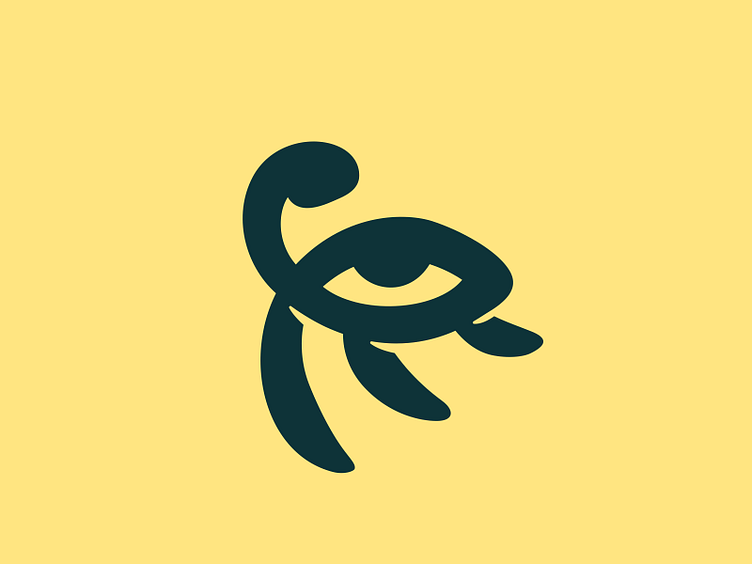
One flat colour, thick rounded strokes and a shell that doubles as an eye. The negative space does the clever work, so the mark stays readable when it is shrunk down. A strong direction for an optician, a vision-related app or any brand that wants a turtle with a second meaning.
2. Digital Turtle
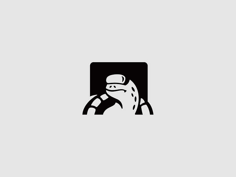
A turtle wearing a VR headset, framed inside a rounded square like an app icon. The strict black and white palette keeps it bold, and the boxed shape makes it ready for app stores and social avatars. A playful fit for tech, gaming and edtech products.
3. Turtle by Gert van Duinen

The shell is built from three sweeping strokes that read as leaves, waves or speed lines. It is a reminder that a turtle logo does not have to feel slow. The single black silhouette works on any background and suits premium, outdoor and sports brands.
4. Brewery Turtle by Ogi Latoh

The shell is a hop cone, so the logo says turtle and craft beer at the same time. This kind of visual pun is the fastest way to make an animal logo feel specific to one business. Perfect for breweries, taprooms and food brands with a slow-crafted story.
5. Turtle logo by Lelevien

A friendly cartoon mascot with a big smile and a classic patterned shell. Mascots like this build instant warmth, which is exactly what kids’ brands, pet shops and family attractions need. For a corporate brand it would feel too casual.
6. Turtle Mark by Tom Anders Watkins

Overlapping shapes with soft green-to-teal gradients give this sea turtle depth without any outlines. It looks modern on a dark background and on screens. A good match for travel, ocean conservation and wellness apps.
7. Sea Turtle by Mohamed Achraf

This shot shows the construction behind the logo: every curve comes from circles based on the golden ratio. That is why the shape feels balanced even though it is very simple. Worth studying if you want a turtle mark that looks calm and precise, for example for a spa, clinic or marine brand.
8. Tortuly by blvckmass13

A land tortoise rather than a sea turtle, with a glossy shell built from layered gradients. The domed shell and sturdy legs feel grounded and dependable. A tortoise logo like this suits insurance, real estate and anything that should feel safe and steady.
9. Turtle logo idea by Roma Kaer

A swimming sea turtle reduced to a handful of rounded shapes in two greens. It shows how little detail a recognisable turtle needs. That restraint makes it easy to use as an app icon, a stamp or an embroidered patch.
10. Honu by Josh

Honu is the Hawaiian word for the green sea turtle, and this design leans into an esports mascot style: thick white outline, sharp angles and a bold orange shell. The outline keeps it readable on jerseys, streams and dark backgrounds. Built for gaming teams, sports clubs and surf brands.
Sea turtle, tortoise or mascot: which style fits?
- Sea turtle logo: flippers and a flatter shell say ocean, travel and conservation. See designs 1, 6, 7 and 9.
- Tortoise logo: a domed shell and sturdy legs say stability and safety. See design 8.
- Mascot: a face, expression and outline say fun and community. See designs 5 and 10.
- Abstract mark: one or two shapes and a clever idea say premium and modern. See designs 2, 3 and 4.
Tips for designing a turtle logo
- Start with the silhouette. If the turtle is not recognisable as a solid black shape, no amount of colour will save it.
- Give the shell a job. The shell is the most recognisable part, so it is the best place for a second idea, like the hop cone or the eye above.
- Test it small. Check the logo at 32px for favicons and app icons. Simplify the shell pattern until it still reads.
- Pick colours with intent. Greens and teals feel natural and calm, navy feels trustworthy, and a bright accent helps a mascot stand out. Our guide to green in branding goes deeper.
- Plan the variations. You will need a full logo, an icon-only version and a one-colour version. Here is how to plan logo variations.
Looking for more animal logo ideas? Browse our collections of snake logos, wolf logos, fox logos and cat logos, or read the key principles of logo design.
Frequently asked questions
What does a turtle logo symbolise?
Mostly longevity, patience, wisdom and protection. Sea turtles add a link to the ocean and conservation, while tortoises lean towards stability and endurance.
Can I use these turtle logos for my business?
No. Every design here belongs to its designer. Use them for inspiration on style, shape and colour, then have an original logo made for your brand.
What is the difference between a turtle logo and a tortoise logo?
A sea turtle has flippers and a flatter, streamlined shell. A tortoise lives on land and has a high domed shell with sturdy, elephant-like legs. Choose the one that matches the story your brand tells.
What file formats should a turtle logo come in?
A vector master (SVG, AI or EPS) for scaling, transparent PNGs for web and social, a PDF for print, and a small icon version for favicons and apps.
Need a logo for a client?
Inkyy is a white label design and development team for agencies. Our in-house brand designers create original logos and full identities that you deliver under your own brand. See our design services or book a 15-minute call.


