


Modern Button UI Kit for Adobe XD (Free, Light and Dark)
 3 min read
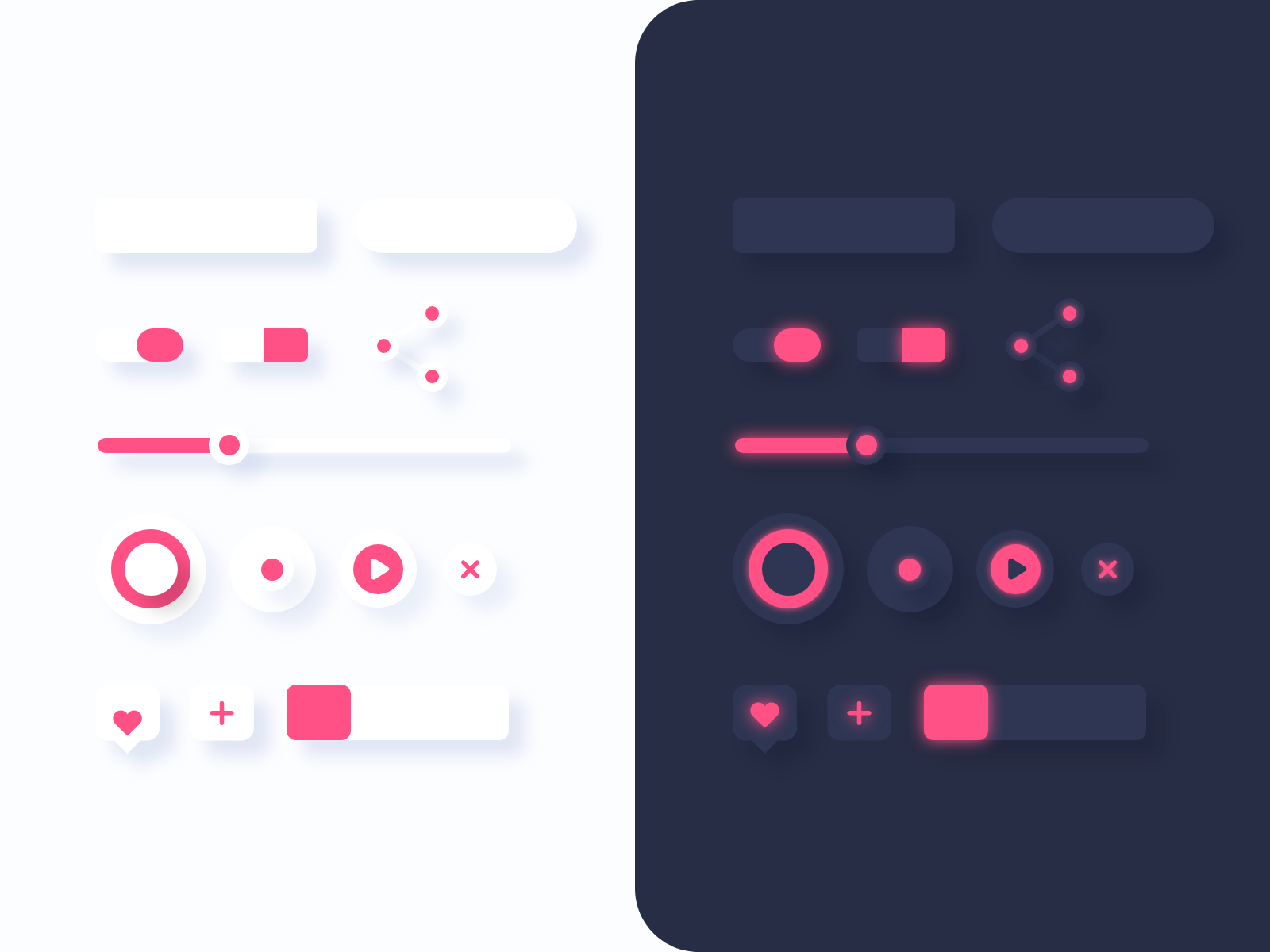
This is a free button UI kit for Adobe XD, made by Inkyy. It has soft, raised buttons, switches, sliders and round icon buttons in a light version and a dark version, with one pink accent colour.
Below you will find what the kit contains, what is inside the ZIP, and how to open the file now that Adobe XD is no longer being developed.
What the button UI kit looks like
The cover is split in two. The left half is an off-white page and the right half is a dark navy panel with a rounded corner. Both halves show the same set of controls, and the dark one adds a soft pink glow. The style is soft and slightly raised, with large blurred shadows and no hard outlines. Each half contains:
- Blank buttons: one rectangle with small corners and one pill, with no label, ready for your own text.
- Switches: a pill toggle and a square toggle, each with a pink knob.
- Share icon: three joined dots.
- Slider: a thin track with a pink fill and a round handle.
- Round buttons: a ring, a dot, a play button and a close cross.
- Small buttons: a heart in a speech bubble, a plus tile, and a bar with a pink square handle.
What is in the download
- File: one ZIP of about 620 KB, with Buttons UI kit – Inkyy.xd inside.
- Artboard: a single artboard called Buttons, 1600 x 1200 px. The light and dark sets sit side by side on it.
- Build: everything is vector shapes with drop shadows, so you can resize and recolour it. The file has no text layers, so no fonts are needed, and no prototype links.
- Colours: pink #ff5186 for the accent, with navy #2e3653 and #272d44 for the dark side and an off-white for the light side.
- Price: free.
Opening the kit in Adobe XD or Figma
Adobe XD is in maintenance mode. Adobe still fixes bugs and security issues, but it is not adding new features. If XD is installed on your machine, the file opens as normal.
If your team works in Figma, the Convertify plugin can import an .xd file into a new Figma page, with its layers, text and images. Check the plugin page for current pricing. Another route is to export the artboards from XD as SVG, drag them into Figma and rebuild the text styles and spacing by hand.
Using the buttons in a design
The kit gives you shapes, not finished components, so build states from them. Duplicate a button for hover, pressed and disabled, and keep the shadow direction the same on every control. Soft, low-contrast buttons look refined but can be hard to see. Make sure a button stands out from its background and that the pink on white or navy is strong enough for the text you place on it. For a small audio or settings screen, the round buttons and sliders are a good start. See the XD music app UI kit for a full example of player controls.
More free interface kits
Browse all our free Adobe XD kits, or try these related files:
- Neomorphic UI elements for XD, a dark set of soft buttons and inputs
- UI elements collection for Adobe XD, with light and dark components
- Creative login screen bundle, to use buttons in context
- Cookie banner UI kit for XD, for small notices with clear actions
Need an interface designed for a client?
Inkyy is a white label design and development team for agencies. Our in-house designers create apps, dashboards and websites that you present under your own brand. See our design services or book a 15-minute call.


