What Makes a Great Esport Mascot Logo
Most gaming teams pick a mascot that looks cool. The best ones pick a mascot that works — at 16px on a mobile screen, stitched on a jersey, printed on a mousepad, and animated into a stream overlay.
That’s the real test. An esport mascot logo isn’t just a piece of art. It’s a brand asset that needs to perform across 10+ different contexts without losing its identity.
After designing logos for gaming teams, streamers, and esports organizations, here’s what we’ve learned separates the ones that last from the ones that get redesigned every 18 months.
The 5 Elements of a Winning Gaming Mascot Logo
Before we get into the inspiration gallery, here’s the framework we use when designing esport mascot logos for clients.
1. Strong silhouette. Your mascot should be instantly recognizable in black and white, at thumbnail size. If you need color to tell what it is, the shape isn’t strong enough.
2. Personality that matches the team. A lynx reads differently than a hydra. A ninja reads differently than a goblin. The character should communicate something true about the team’s playstyle or culture — aggressive, tactical, chaotic, elite.
3. Scalability built in. Logos used in esports appear at wildly different sizes. The mascot needs to work as a standalone icon AND as part of a full wordmark. Many of the logos below have secondary simplified versions for small applications.
4. Typography that holds its own. The font is not an afterthought. Strong gaming logos pair a detailed mascot with a typeface that carries weight on its own — typically bold, condensed, sometimes with custom modifications.
5. A limited, intentional color palette. Most of the best esport logos use 2-3 colors maximum. Rich, vibrant primaries dominate — deep blues, electric greens, aggressive reds — with a neutral or black for grounding.
20+ Esport Mascot Logo Ideas
Design Inspiration Gallery
The following examples represent some of the strongest gaming mascot logos in current circulation. Each one does something specific well — we’ve noted what to take away from each.
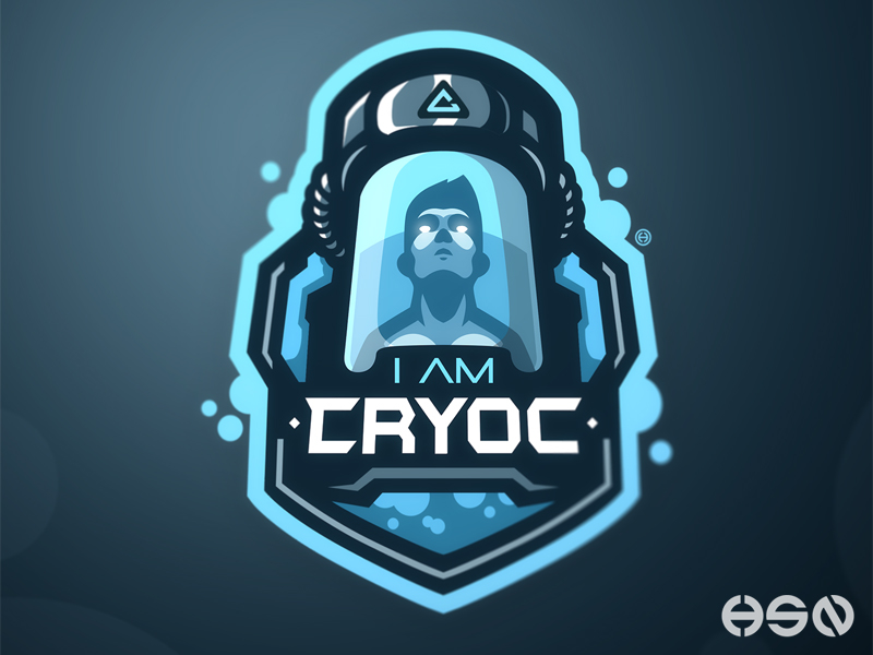
1. I Am Cryok
A human figure frozen in a cryogenic chamber. Effective because the concept is unusual — not a warrior or beast, but a strategic reference to the game persona. Works well for a solo streamer building a lore-driven brand.
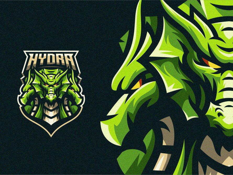
2. Angry Hydra Mascot
Multi-headed mythological creature rendered with sharp, aggressive line work. The hydra works because it implies difficulty — you can’t kill it easily. Strong choice for a team that wants to communicate resilience.
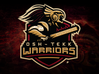
3. Osh Tekk Warriors
Aztec warrior design with historically rooted aesthetics. This one is a masterclass in cultural specificity — it tells a story that a generic warrior logo never could. The complexity of the headdress rewards close inspection without overwhelming the silhouette.
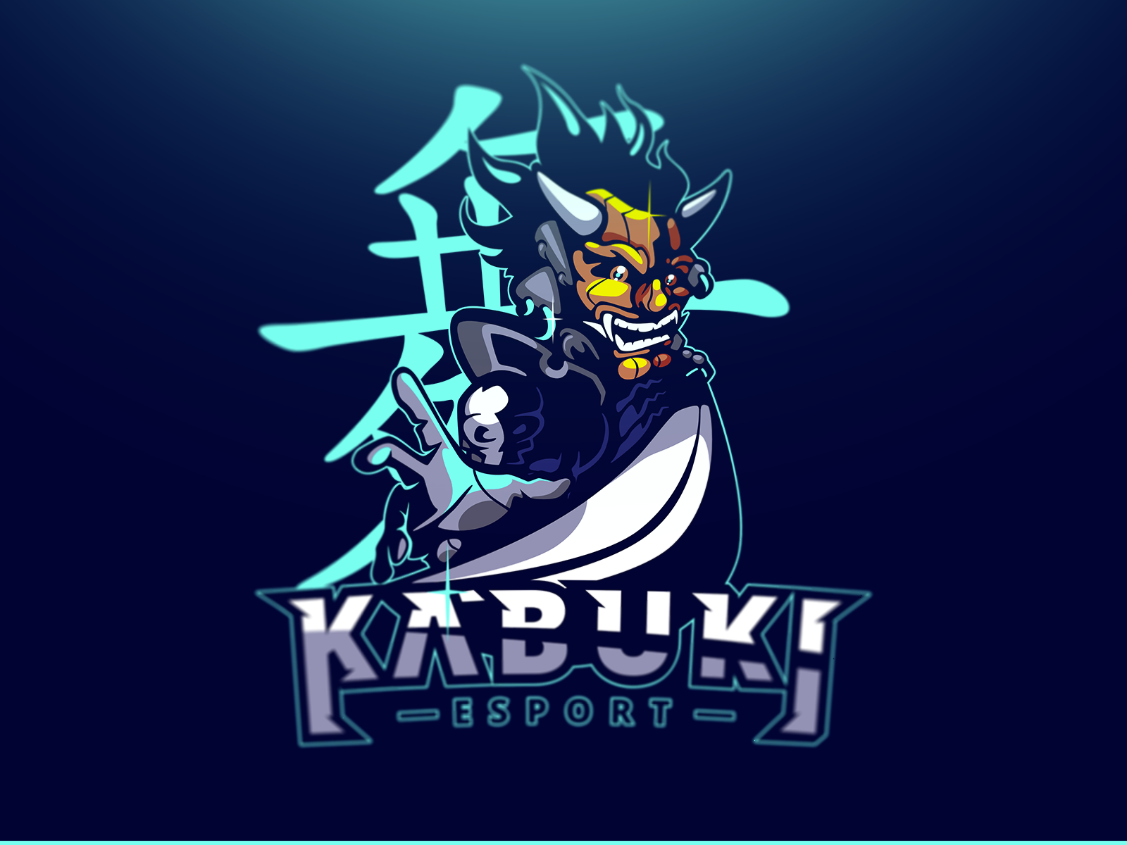
4. Kabuki Esport Mascot
Designed by Didier, this ninja-kabuki hybrid uses negative space intelligently. The mask does the heavy lifting — every other element supports it. A lesson in restraint: when your hero element is strong, don’t compete with it.
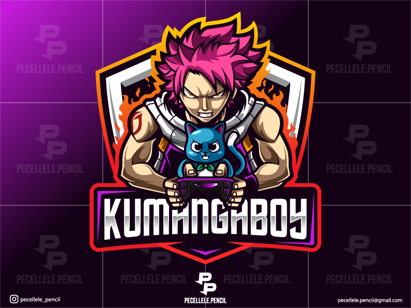
5. Natsu Anime-Inspired eSport Mascot
By Irvan Ramdani. Anime aesthetics are dominant in gaming culture — this logo leans into it directly. The controller prop grounds it in the gaming context, preventing it from reading as just a character illustration.
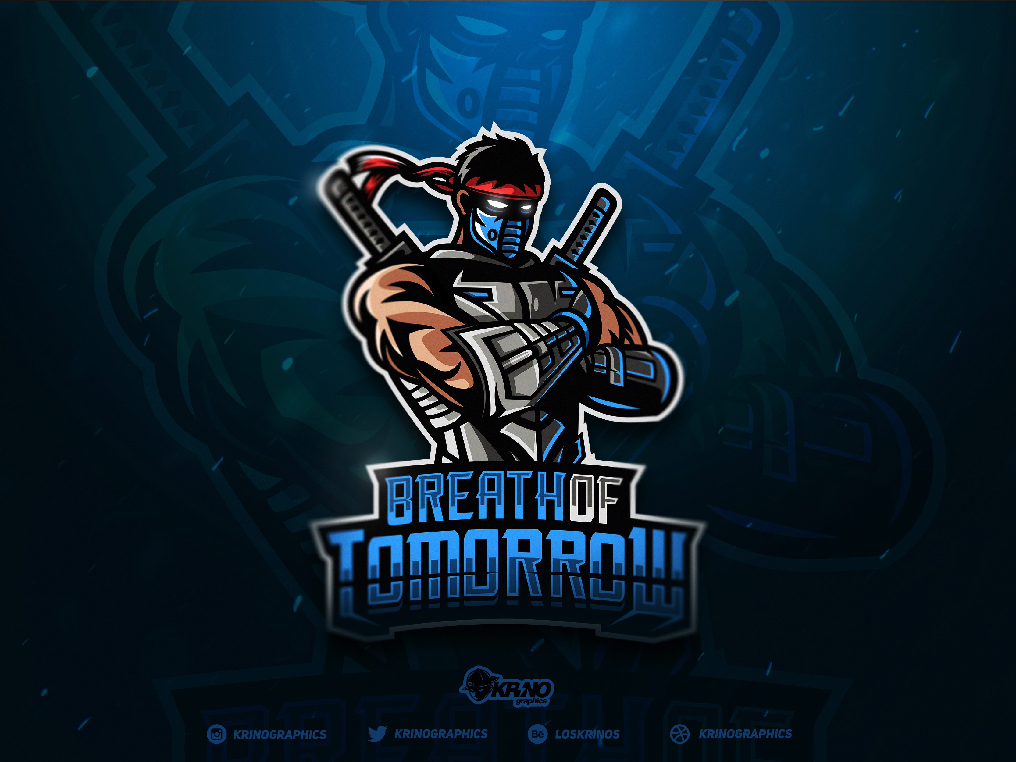
6. Ninja Mascot Logo
By Dmitry Krino. Dual swords, full mask, clean execution. What makes this work is the sense of motion — the character looks ready to act, not posed for a photo. Action-forward mascots tend to perform better in animated contexts.
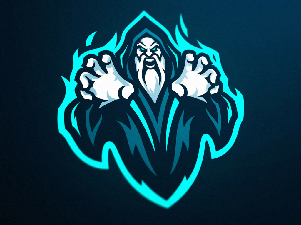
7. Warlock Esports Mascot Logo
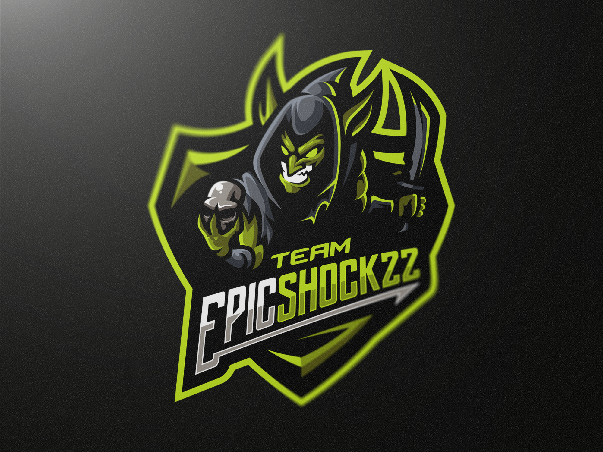
8. Goblin Gaming Mascot
By Marvin Baldemor. Green-dominant palette, asymmetric features, chaotic energy. Goblins communicate a specific team personality — scrappy, unpredictable, dangerous to underestimate. If that’s your team, own it fully like this one does.
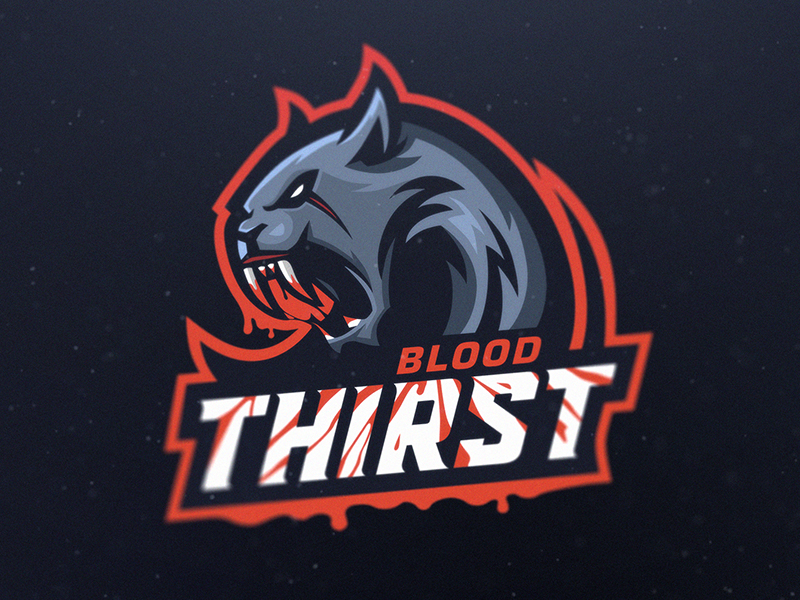
9. Saber-Tooth Blood Thirst Mascot
By HSSN DSGN. Prehistoric predator rendered with dripping detail. The blood element is a deliberate aggression signal — this one is not trying to be approachable. Effective for teams in brutal, competitive formats like battle royale.
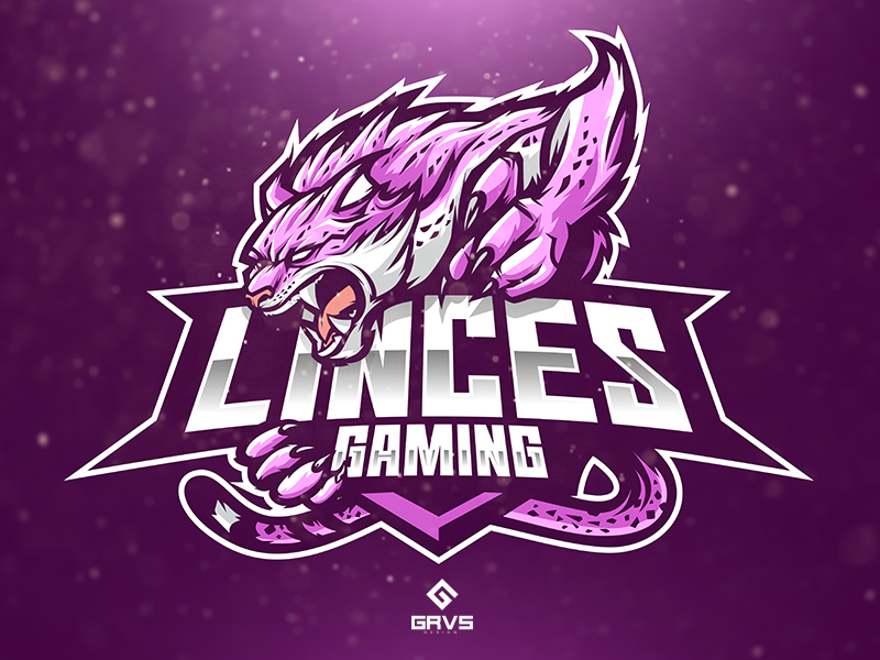
10. Linces Gaming
By Febryan Satria. The lynx is an underused animal in gaming mascots — this design takes full advantage of that gap. Sharp ears, focused eyes, tension in the neck. A predator that doesn’t need to roar to be threatening.
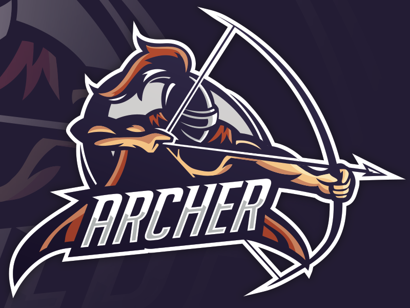
11. Archer Mascot
By Mike (VortekDesign). Helmeted archer in action stance. Clean composition, strong value contrast, works in single color. A good example of a “premade-ready” gaming mascot that still has enough personality to feel custom.
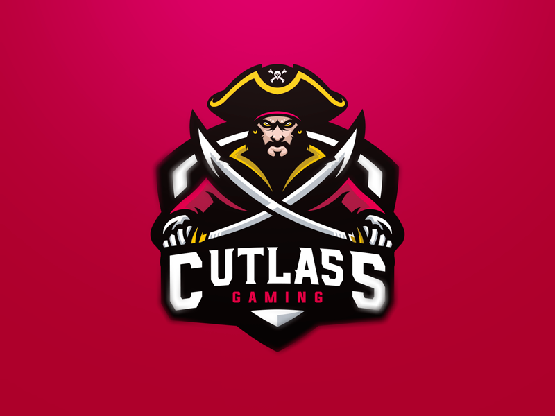
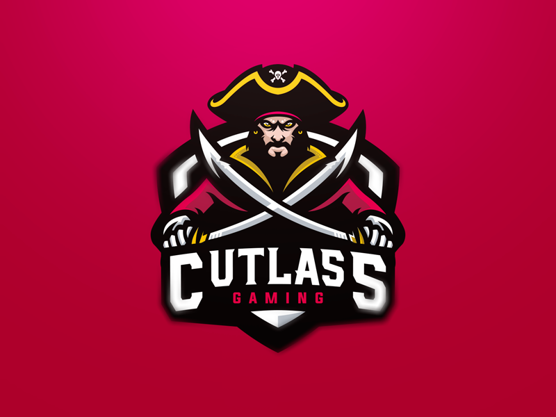
12. Cutlass Pirate Gaming Mascot Logo
By JP Design. Pirates are a perennial gaming mascot because they communicate freedom, risk, and unpredictability. The dual-cutlass pose adds aggression. Execution here is strong — the linework is confident without being overworked.
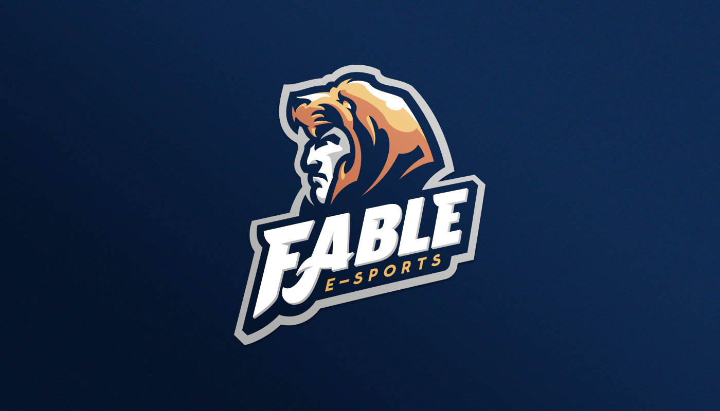
13. Fable eSports Barbarian Mascot
By Dlanid. Half-man, half-beast character — the transformation aesthetic reads as power unlocked. The eSports name pairs well with the mythological character type. Works especially well for RPG-adjacent communities.
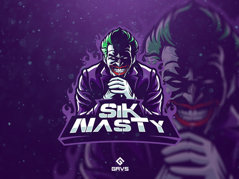
14. SiK NasTy Esport Team
By Febryan Satria. Joker-inspired character with gaming culture overlay. The wild card archetype is strong in gaming — unpredictable, intimidating, visually distinctive. This version executes it with confident color and expression.
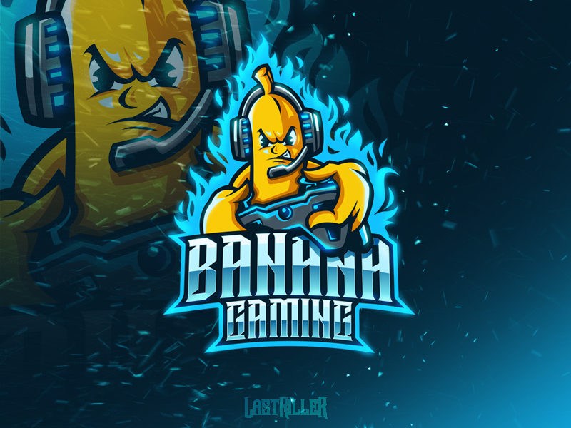
15. Banana Gaming Mascot Logo
By lastkiller. A deliberately absurd choice that works because it commits fully. The banana is aggressive, not cute. This is a lesson in how humor can be a branding strategy — if it’s intentional and executed well, it creates recall.
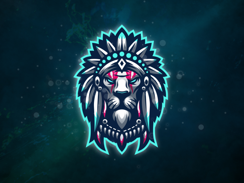
16. Tribal Lion Mascot
By Modal Tampang. Tribal patterning adds cultural depth to what could be a generic lion mascot. The geometric layering inside the mane is the detail that elevates it. Good model for teams that want to combine natural power with cultural identity.
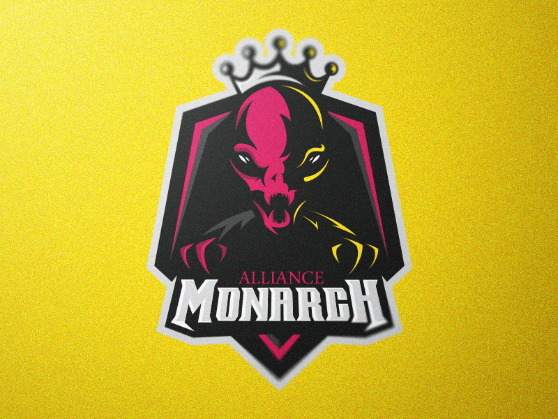
17. Alien Monarch
By Ioann Caelum. Pink alien with crown — unusual color palette for a gaming mascot, which is exactly what makes it stand out. Dominance signaled through the crown, strangeness signaled through the alien form. Strong choice for teams that want to be memorable rather than intimidating.
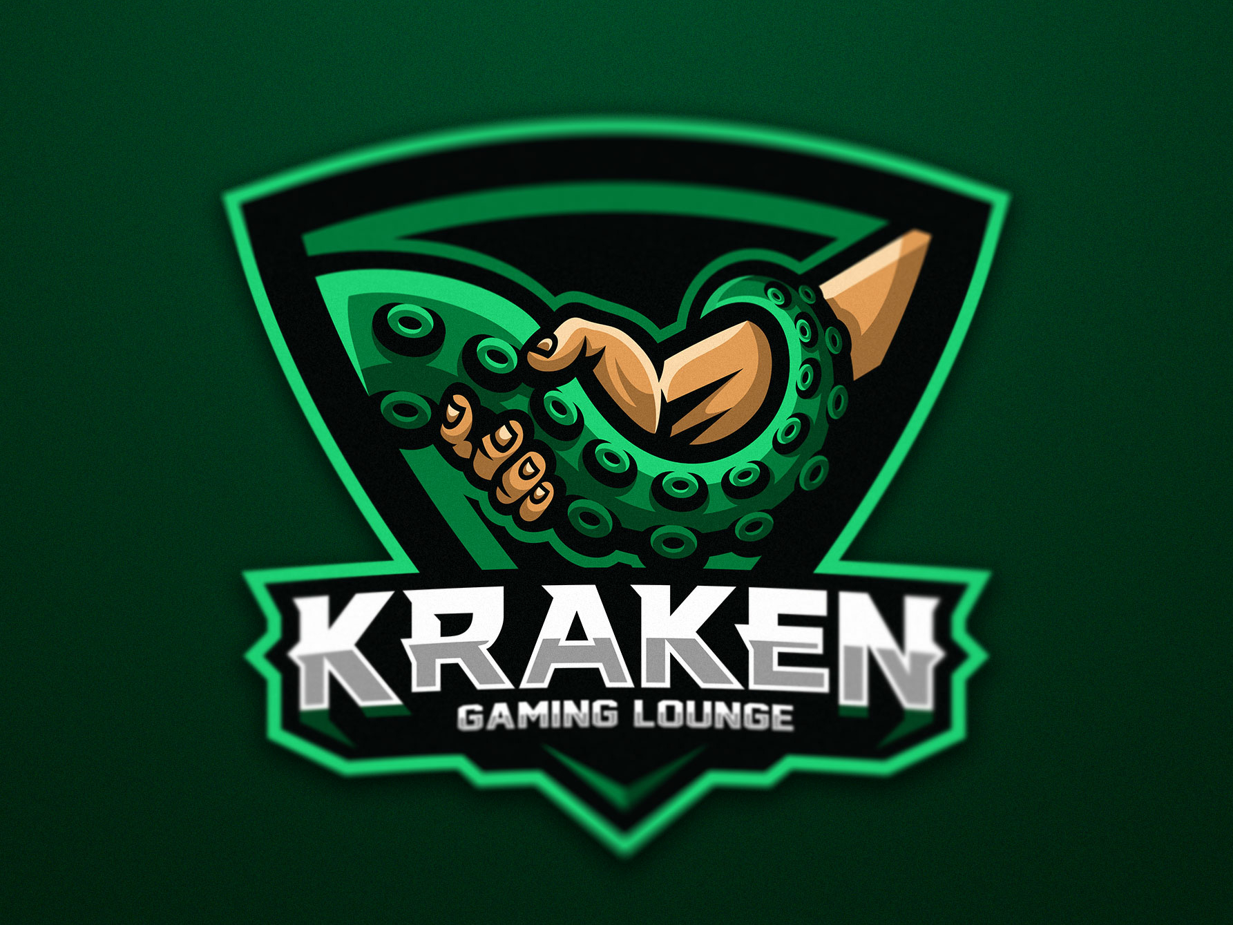
18. Kraken Gaming Lounge Logo
By Dmitry Krino. Tentacle handshake concept — the Kraken as a welcoming host. This one works for a gaming lounge or community brand rather than a competitive team. Conceptually clever: the monster is offering hospitality. Subverts expectations.
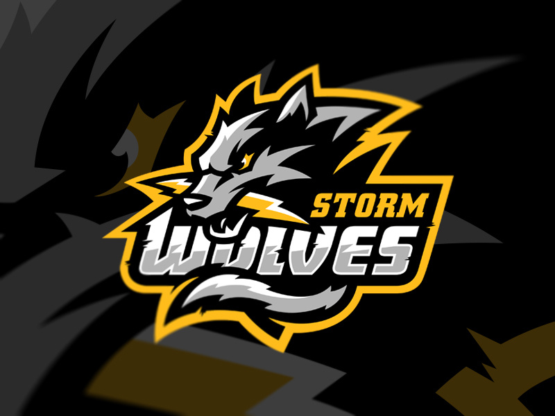
19. Storm Wolves
By Igor Mariev. Wolf biting lightning — kinetic, elemental, aggressive. The action (biting electricity) creates energy in the image without requiring motion. Strong composition where two power symbols reinforce each other.
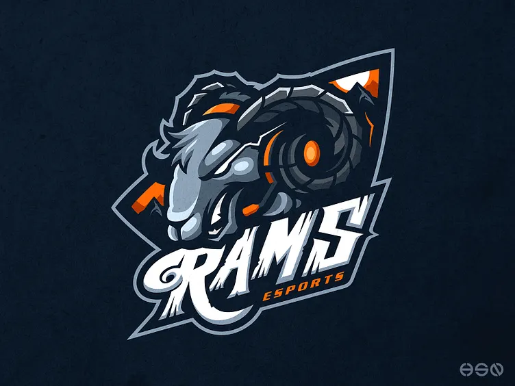
20. RAMS eSports
Common Mistakes to Avoid When Designing an Esport Mascot Logo
We’ve reviewed hundreds of gaming logo briefs. These are the mistakes that show up most often.
Too much detail for the size it will actually be used at. A mascot with intricate line work in the beard, armor, and background looks impressive in a full-size render and falls apart at 64x64px as a Discord avatar. Design for the smallest use case first.
Choosing an animal or character because it’s cool, not because it’s you. Dragons and wolves are popular because they’re powerful — but if 20 teams in your region use the same archetype, yours will blend in. The Ape 300 and Banana Gaming examples above stand out precisely because they made unexpected choices.
Letting the typography be an afterthought. Half the identity is in the wordmark. A strong mascot paired with a weak or generic font (Impact, uninflected bold sans-serifs) loses half its impact immediately.
No version control from the start. Build a full version, a simplified icon, and a horizontal layout before you finalize. If the mascot only works in one configuration, it’s not finished.
Frequently Asked Questions About Esport Mascot Logo Design
How much does a custom esport mascot logo cost?
Custom esport mascot logos typically range from $150 to $2,000+ depending on complexity, the number of included variations, and whether you need animation-ready files. Simpler flat-style mascots cost less. Detailed illustrative mascots with multiple expressions and poses cost more. At Inkyy, we scope each project individually — book a 15-minute call to get an accurate quote.
What file formats should a gaming mascot logo come in?
At minimum: SVG and PNG with transparent background. Ideally also: AI or EPS source files, a dark-background version, a light-background version, and a single-color version for embroidery and print. Ask for all of these upfront — retrofitting later is expensive.
How long does it take to design an esport mascot logo?
A well-executed custom mascot takes 1-3 weeks for concept, refinement, and delivery — sometimes longer for complex illustrative styles. Rush timelines are possible but tend to reduce iteration quality. Budget at least two weeks if the launch date matters.
Can I use an AI-generated mascot logo for my esports team?
Technically yes. Practically, there are three issues: AI-generated logos are not legally copyrightable in most jurisdictions (as of 2024), they typically can’t be exported as clean vector files, and they’re often visually inconsistent across applications. For a team brand you plan to use long-term, a custom-designed vector mascot is worth the investment.
What’s the difference between a mascot logo and a wordmark logo?
A mascot logo centers on a character illustration — animal, person, creature, or abstract figure. A wordmark logo is purely typographic. Most competitive esports teams use both: a mascot for visual identity and a wordmark for merchandise and formal communications. They should be designed as a system, not separately.
 Book a Meeting