35 Snake Logo Ideas and What Makes Each One Work
 9 min read
A snake logo grabs attention fast. Snakes stand for change, healing, danger and wisdom all at once, so the same animal can sell a yoga studio, a pharmacy, an esports team or a jewellery brand. Whether you call it a snake or a serpent logo, it all depends on how you draw it.
Below are 35 snake logo designs worth studying, grouped by style: lettermarks, cobra and viper mascots, geometric marks and symbolic illustrations. For each one we look at what the designer did well and what kind of brand it suits, so you can take the ideas, not the artwork, into your own project.
What a snake logo says about a brand
- Change and renewal: a snake sheds its skin, so it suits rebrands, wellness, beauty and personal growth.
- Healing: the Rod of Asclepius, a single snake on a staff, is the classic symbol of medicine. Clinics, pharmacies and health apps use it.
- Power and danger: a cobra or viper with fangs says speed and aggression. Sports teams, gaming brands and security firms like that.
- Wisdom and mystery: coiled snakes, knots and infinity loops feel ancient and clever, which fits luxury, tattoo and creative brands.
The common traps are a snake that looks like a worm or a rope because the head is unclear, scale textures that turn to mush at small sizes, and an aggressive pose on a brand that needs to feel safe. Also think about your audience: a snake can feel friendly in one market and threatening in another.
35 snake logo designs for inspiration
Each heading credits the designer. Numbers run straight through, so the tips below can point back to them.
Letter and monogram snake logos
1. Snake Logo by Ery Prihananto
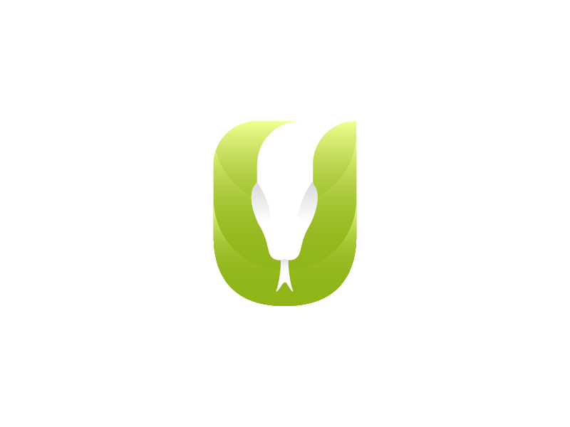
The arms of the U become the sides of the snake’s head, with the white face in the gap between them. A neat way to hide an animal in one letter, for a tech or outdoor brand starting with U or V.
2. F Snake by Mark Farris
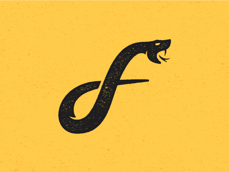
The body draws a lowercase f, and the worn print texture and open fangs give it a rough, vintage feel. It would suit a tattoo studio, a craft brewery or a clothing label.
3. Snake Logo by Gary Dimi Pohty
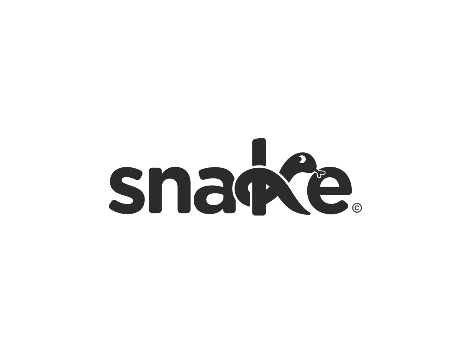
A plain, bold wordmark where only the k turns into a snake head, so the name stays easy to read. A smart, light touch when the brand name already says snake.
4. Snake by Alexia Dupré-Doàn
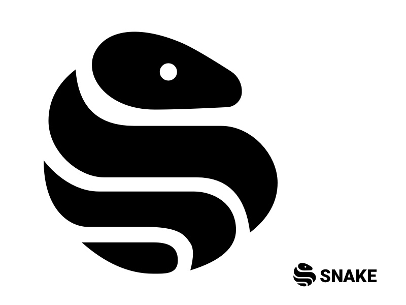
A heavy black snake fills a circle and folds into an S, with one white dot for the eye. The thick, even shapes hold up from favicon to signage, and suit a sports brand as well as a studio.
5. S + Snake by Michal Tomasovic
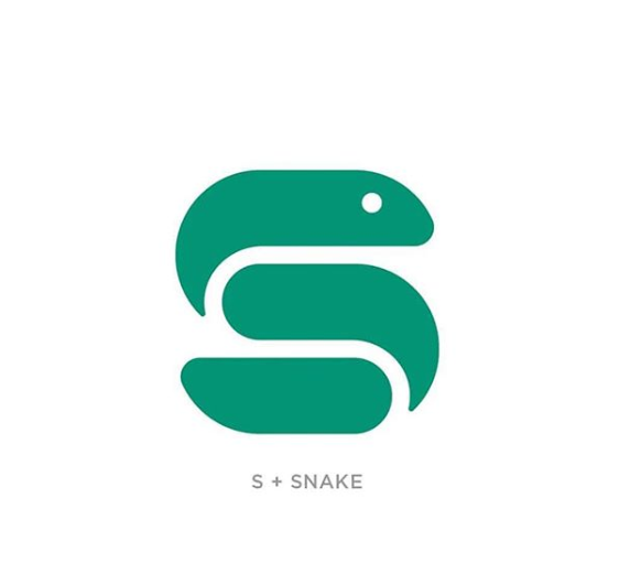
A chunky teal S where the top curve becomes the head. Rounded ends and a friendly eye keep it approachable, so it would sit well on an app icon, a pet shop or a kids’ learning brand.
6. S is for Snake by Ling Lee

A slim, pale snake traces an S, with a soft shadow that makes the body look like folded ribbon. The calligraphic line fits beauty, fashion and wellness brands.
7. S Snake Logo by Sebastian
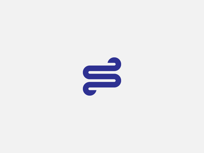
One continuous navy line folds back on itself into an S, with almost no detail. Marks this simple are easy to animate and work well for software and fintech products.
8. S Snake Logo by Malmoo
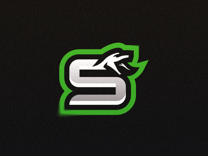
A metallic S topped with a sharp snake head and wrapped in a bright green outline that keeps it readable on streams and jerseys. Built for gaming teams. See more esport mascot logo ideas.
9. J + Snake by Yuri Kartashev
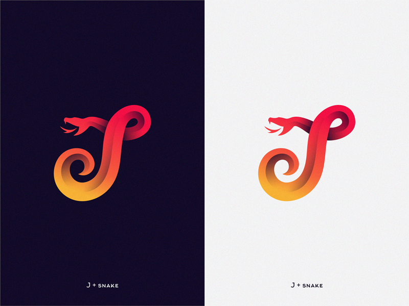
The body curls into a J, with the head and forked tongue at the top, shown on both dark and light backgrounds. The warm gradient suits a creative studio, a music brand or a nightlife venue.
10. Premade Snake Logo by Matthieu.H
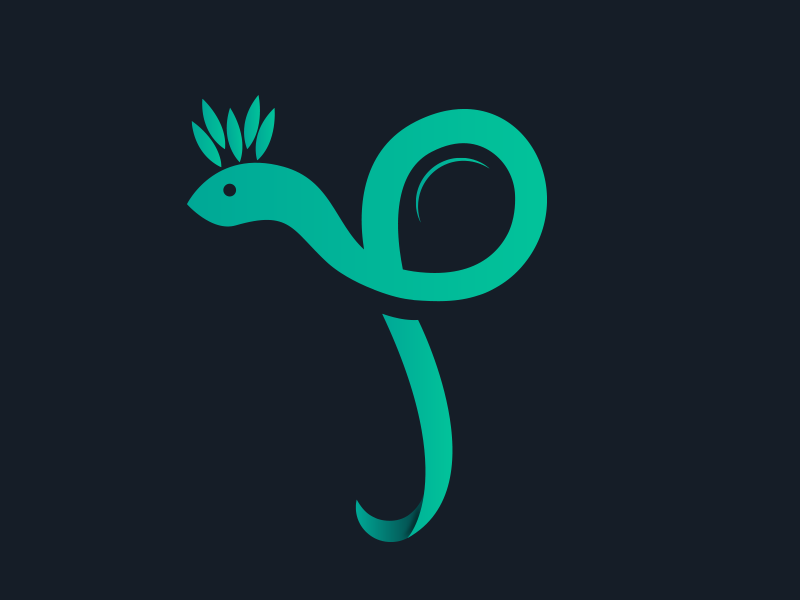
A teal snake loops into a P, and a tuft of leaves on its head adds a touch of nature. It could work for a plant shop, a herbal product or an eco brand.
11. Snake Logo by Levi Foster
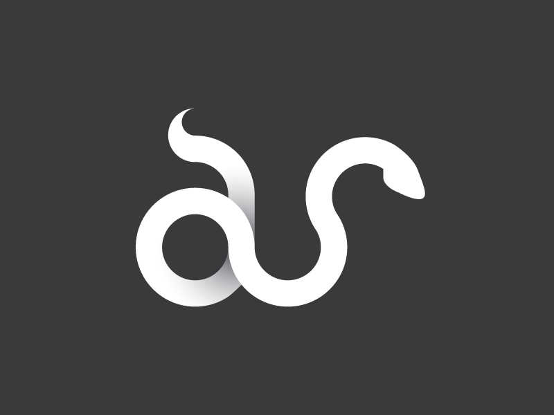
One white body spells a lowercase a and s, with soft grey shading where the line folds. A clever option for initials or short brand names.
12. Snake Monogram E+S+C by Abraham Urias
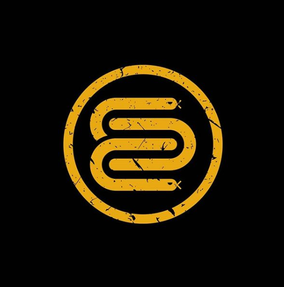
A gold body folds back and forth inside a ring, with snake heads at the ends of the path. The scratched texture gives it a worn badge look for apparel, a barber shop or a motorcycle club.
13. Snakey by Filip Pietron
A small knotted snake in warm yellows sits beside a rounded lowercase wordmark. The playful colours fit a toy, snack or children’s brand.
14. SnakeIO Icon by Kemal Demirpolat
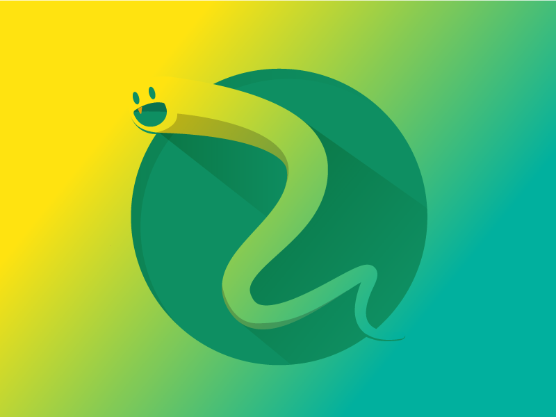
An icon for a snake game, with a smiling cartoon snake winding across a circle. The long shadow and bright gradient are made for app stores, and show a snake can feel cheerful.
Cobra, viper and mascot snake logos
15. Cobra by Daniel Perez
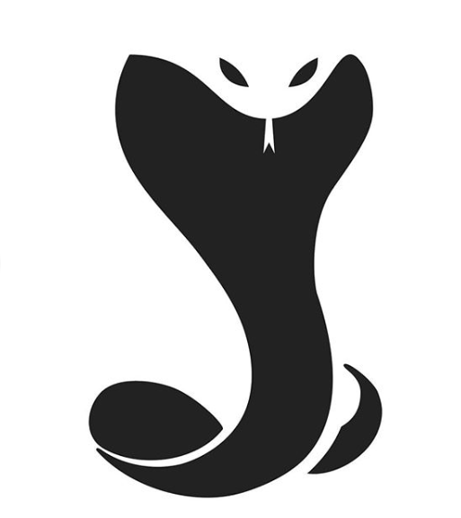
A bold black cobra logo with its hood spread, and the eyes and fangs cut out in negative space. The silhouette stays clear at tiny sizes, which makes it a strong base for security, fitness or motorsport brands.
16. King Cobra by Nikita Golubev
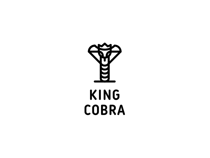
A monoline cobra with its hood spread like a crown, above a stacked wordmark. The even line weight feels calm and premium, right for a barbershop, a spirits label or a menswear brand.
17. Snake by Nick Kumbari
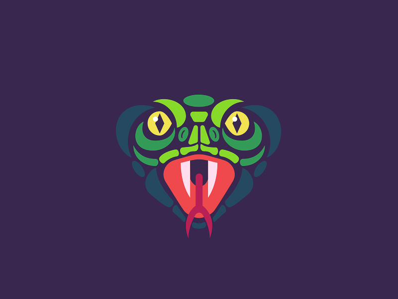
A symmetrical front view of a snake head with yellow eyes, fangs and a forked tongue. Flat colours make it feel like a sports badge for an esports team, an energy drink or a streetwear label.
18. Viper by The Branding Shop
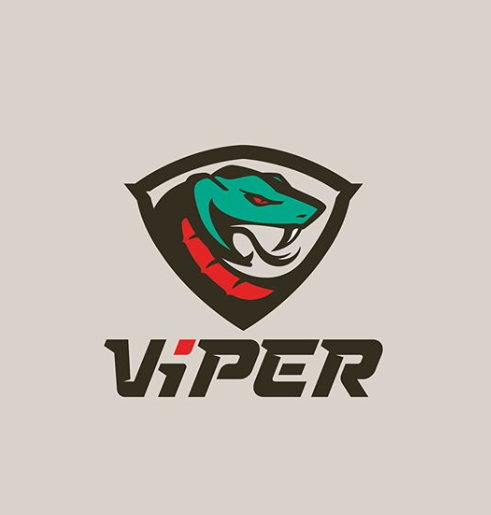
A classic mascot logo with a teal viper bursting out of a shield above a slanted wordmark. Exactly the style sports clubs and gaming teams use on kits and banners.
19. Snake Speriment by Laura Bohill
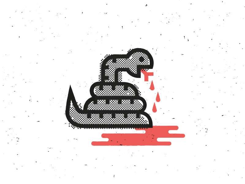
A coiled halftone snake in a retro comic style, with red drips pooling underneath. More illustration than business logo, it would suit a horror podcast, a tattoo shop or band merchandise.
Geometric and abstract snake logos
20. Kingsnake Works by Bram Huinink
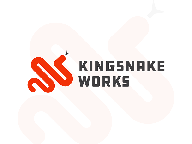
A red snake built from rounded zig-zags beside a heavy, squared wordmark, with the red nodding to the real kingsnake. A solid full lockup for a workshop, studio or manufacturer.
21. Snake Electric by Ivana Sivac
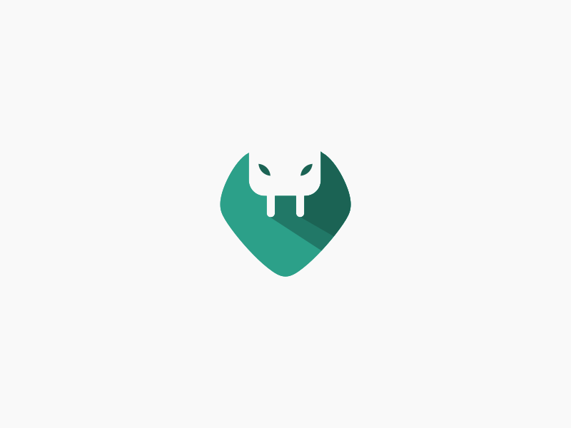
The head carries a white plug, so the two prongs double as fangs. One idea, two meanings, perfect for an electrician, an EV charging brand or a power tool company.
22. Snake Mark by Neko Brand Studio
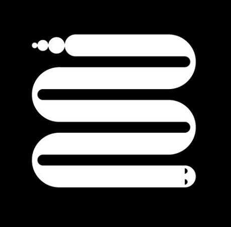
The body folds into neat parallel rows, with three shrinking dots for the rattle and a small head at the end. A good base for a tech product, a coworking space or a print studio.
23. Twin Snake by Vitalii Soroka
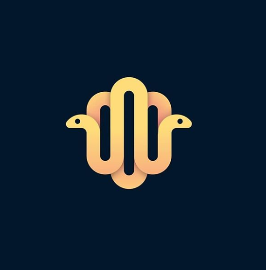
Two snakes loop into a mirrored shape with their heads facing outwards. The symmetry feels like an emblem and could stand for a partnership or a wellness brand.
24. Snake Wave by Breno Bitencourt
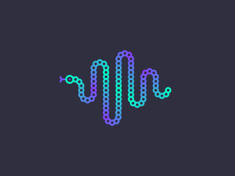
The body is a chain of dots that rises and falls like an audio waveform, in a blue to purple gradient. A natural fit for a podcast, a music app or an audio tech company.
25. Target Snake by Shibu PG
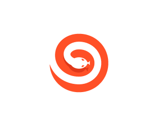
An orange snake coils into a spiral with its head at the centre, like a target. One flat shape makes it easy to reproduce, and it suits a marketing agency or any brand about focus.
26. D Snake by Stevan Rodic
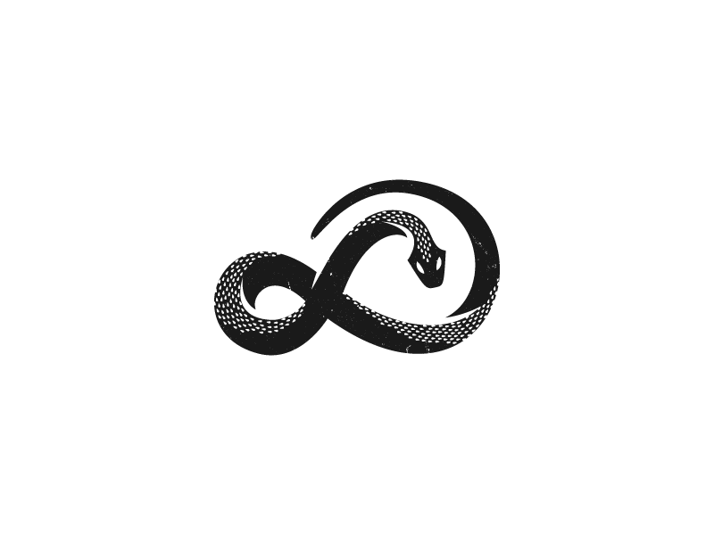
The snake twists into an infinity loop, close to the ancient ouroboros. The scales add craft but need a simpler version for small sizes. A fit for a jeweller or a tattoo studio.
27. INTJ Design by Robert Williams
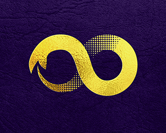
A gold snake loops into an infinity sign, shown as foil on purple leather to preview premium packaging. Ideal for luxury goods. See more luxury logo designs.
28. Snake Logo by Matija Sundalic
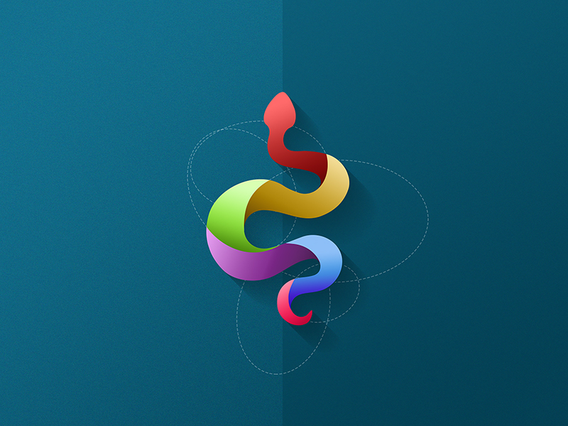
A colourful snake shown over the circles used to draw it, which helps sell the idea to a client. The bright palette fits creative agencies, apps and events.
Illustrated, symbolic and medical snake logos
29. Howler Brothers pt. V by Jay Fletcher
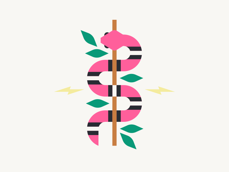
Made for the clothing brand Howler Brothers, this striped snake winds around a staff between leaves and lightning bolts. It feels like a patch or a print, a good reference for apparel and outdoor brands.
30. Public Enemy Number One by Ben Stafford
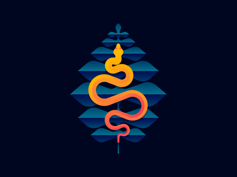
A glowing orange snake winds down through a stack of blue leaf shapes, and the warm against cool contrast makes it jump out. It works as poster artwork or for a drinks brand with a story.
31. Naga Yoga by La Gordo
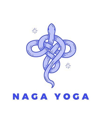
A soft lavender snake tied in a knot above a spaced-out wordmark. Naga is the serpent figure from Hindu and Buddhist tradition, which ties the name to the symbol for a yoga or meditation brand.
32. Snakes and Stuff by Tyler Anthony
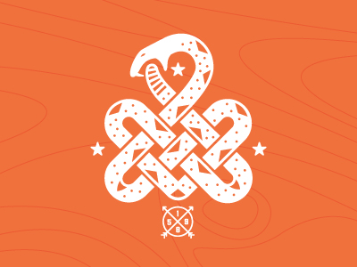
A white snake ties itself into an interlaced knot, framed by stars and a small arrow badge. It reads like a vintage camp patch for outdoor gear and adventure brands.
33. Snake by Dusan Rozic
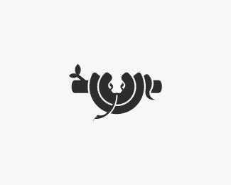
A snake coiled around a branch, facing forward, with the head drawn in negative space. A simple, balanced mark for a nature reserve or a garden centre.
34. Hospitalist Consulting Solutions by Legofish
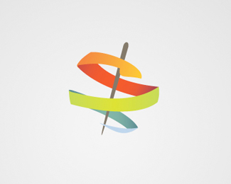
A colourful ribbon wraps around a thin staff, a modern take on the Rod of Asclepius that hints at medicine without looking clinical. Our pharmacy logos show more ideas in this space.
35. Serpent Medical by Angela

An S-shaped snake built from blue and green blocks above a bold wordmark. The cool colours feel clean and trustworthy for a clinic, a lab or a medical supplier.
Tips for designing a snake logo
- Make the head obvious. A clear head, an eye or a forked tongue is what turns a curved line into a snake. Without it, people see a ribbon.
- Let the curve carry the mood. Smooth S-curves feel calm and elegant. Sharp zig-zags and open jaws feel fast and aggressive. Pick the one that matches the brand.
- Use the body as a letter. Snakes bend easily into S, J, P or even whole words, as designs 1 to 14 show. It is the quickest way to make the mark feel specific to one business.
- Keep scales optional. Texture looks great on a poster and disappears at 32px. Design a flat version first and add detail only where it helps. Our key principles of logo design cover this in more depth.
- Plan the variations. You will need a full lockup, an icon on its own and a one-colour version. Here is how to plan your logo variations.
- Check the symbolism. Medical brands should use one snake on a staff, not the caduceus with two snakes and wings, and anything for children should avoid fangs.
Looking for more animal logo ideas? Browse our wolf logos and turtle logo ideas.
Frequently asked questions
What does a snake logo symbolise?
Mostly transformation, healing, protection and power. The pose and style decide which meaning comes through: a calm snake on a staff says medicine, while a cobra with fangs says danger and speed.
Can I use these logos?
No. Every design here belongs to its designer or the brand it was made for. Use them as inspiration for style, shape and colour, then have an original snake logo made for your business.
What is the difference between the Rod of Asclepius and the caduceus?
The Rod of Asclepius has one snake wrapped around a staff and is the traditional symbol of medicine. The caduceus has two snakes and a pair of wings and belongs to Hermes, the messenger god. Many medical brands mix them up, so choose on purpose.
What colours work best for a snake logo?
Black feels powerful and premium, red and orange add energy, and blue or teal feel clean and medical. Green is the obvious choice, so if you use it, give the design a twist. Our guide to green in branding explains how to make it work.
Need a snake logo for a client?
Inkyy is a white label design and development team for agencies. Our in-house brand designers create original logos and full identities that you deliver under your own brand. See our design services or book a 15-minute call.